
Unichem E-commerce
Bridging the gap between health content and retail
Marketing, eCommerce
1 month for design (May - June 2025), 3 months for development (July - September 2025)
1. Context
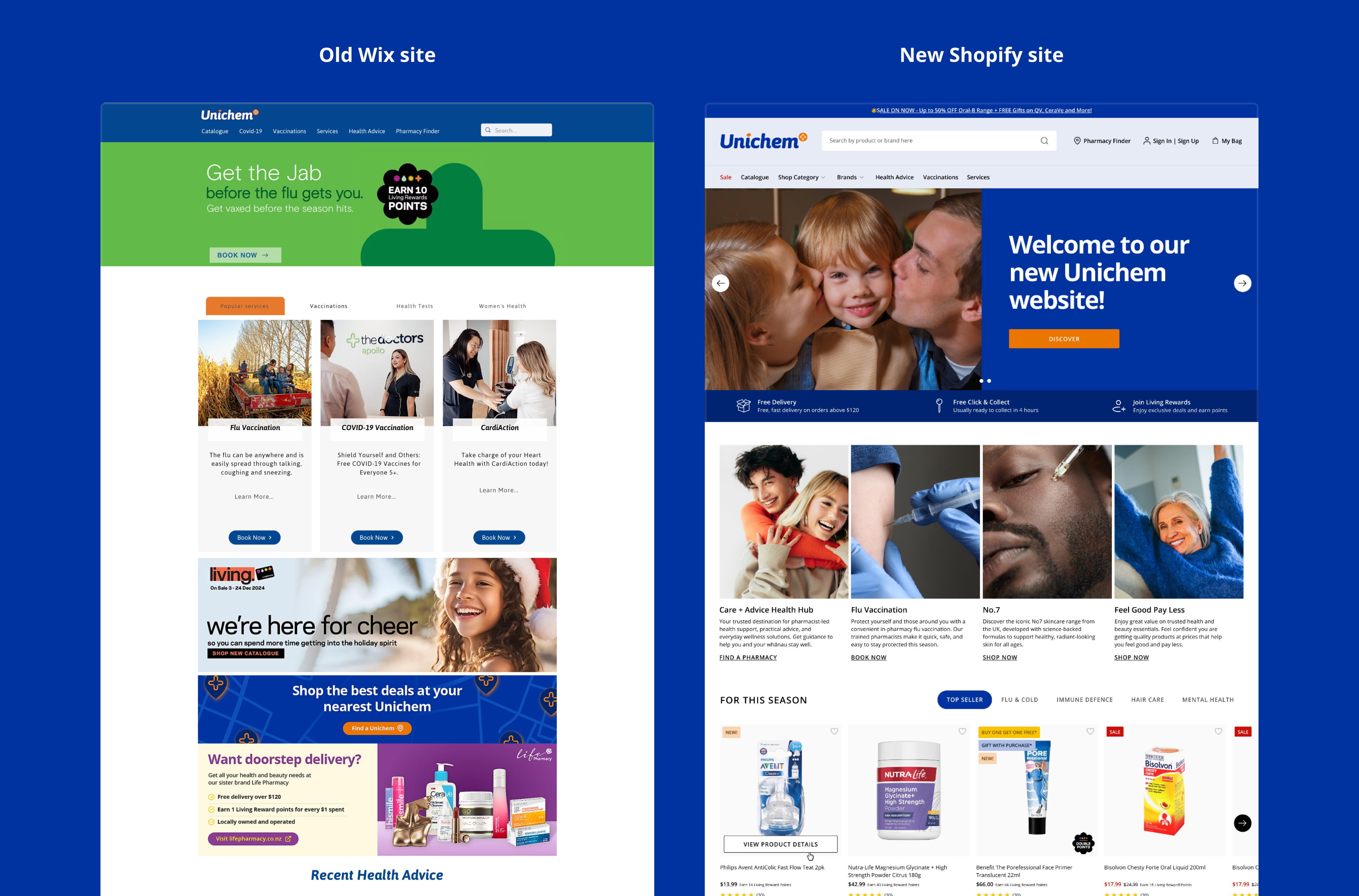
Unichem is one of New Zealand’s largest community pharmacy networks (part of Green Cross Health). Before this project, our digital retail presence was heavily fragmented. Customers could buy from our physical stores, browse a paper mailer, book health services on our Wix site, or order via Uber Eats—but there was no central online store.
2. The problem
Our existing Wix website was cost-effective, but it didn't support e-commerce and lacked a professional finish. This created a few major roadblocks:
- Double the work: We had to create entirely separate design deliverables for Life Pharmacy (our sister brand on Shopify) and Unichem (Wix).
- Dead-end marketing: We couldn't link our paid ads or social media directly to a Unichem storefront, severely limiting our online visibility and sales.
3. Key goals
4. Challenges
Challenge 1: The two-site shuffle
The Goal: Ensure a seamless user journey when jumping between the Wix content site and the Shopify e-commerce site.
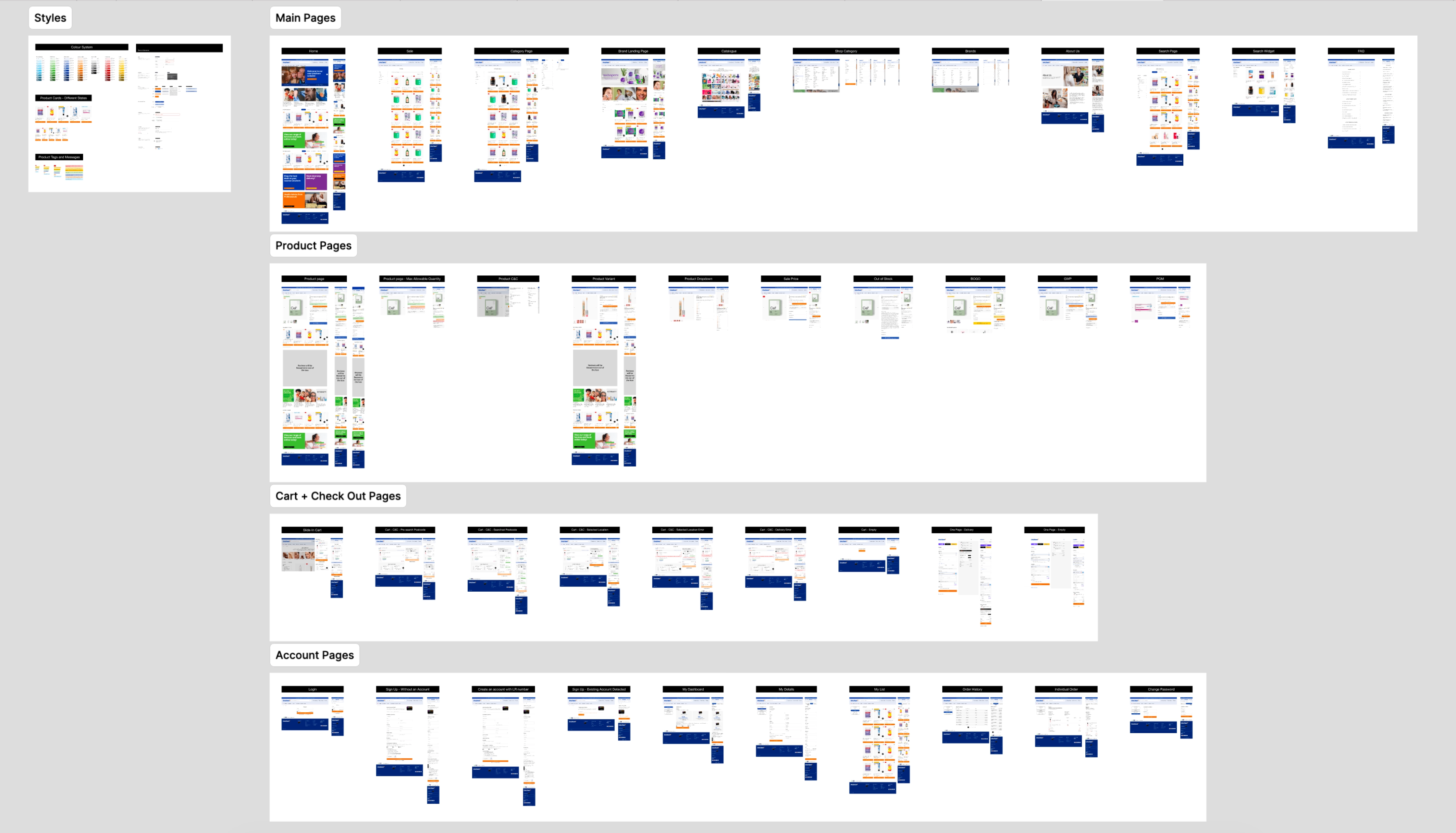
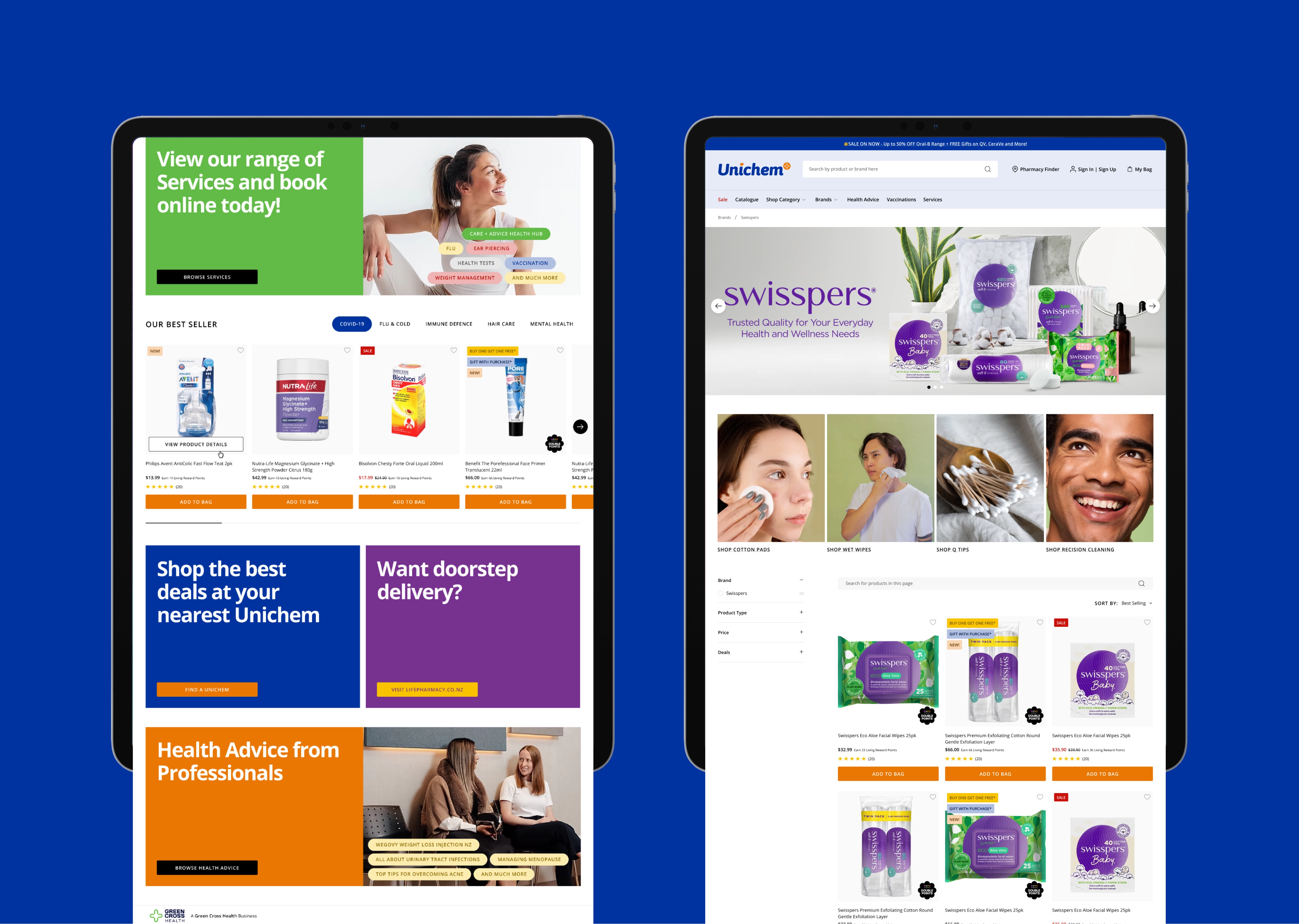
The Solution: We mapped out the Information Architecture in Miro to draw a hard line: content and bookings stayed on Wix, while retail moved to Shopify. To hit our tight launch deadlines, we skipped traditional wireframing and leveraged the layout from Life Pharmacy’s site. By matching the look and feel across both domains (unichem.co.nz and healthservices.unichem.co.nz), we created a streamlined experience where users barely notice they are navigating between two different platforms.
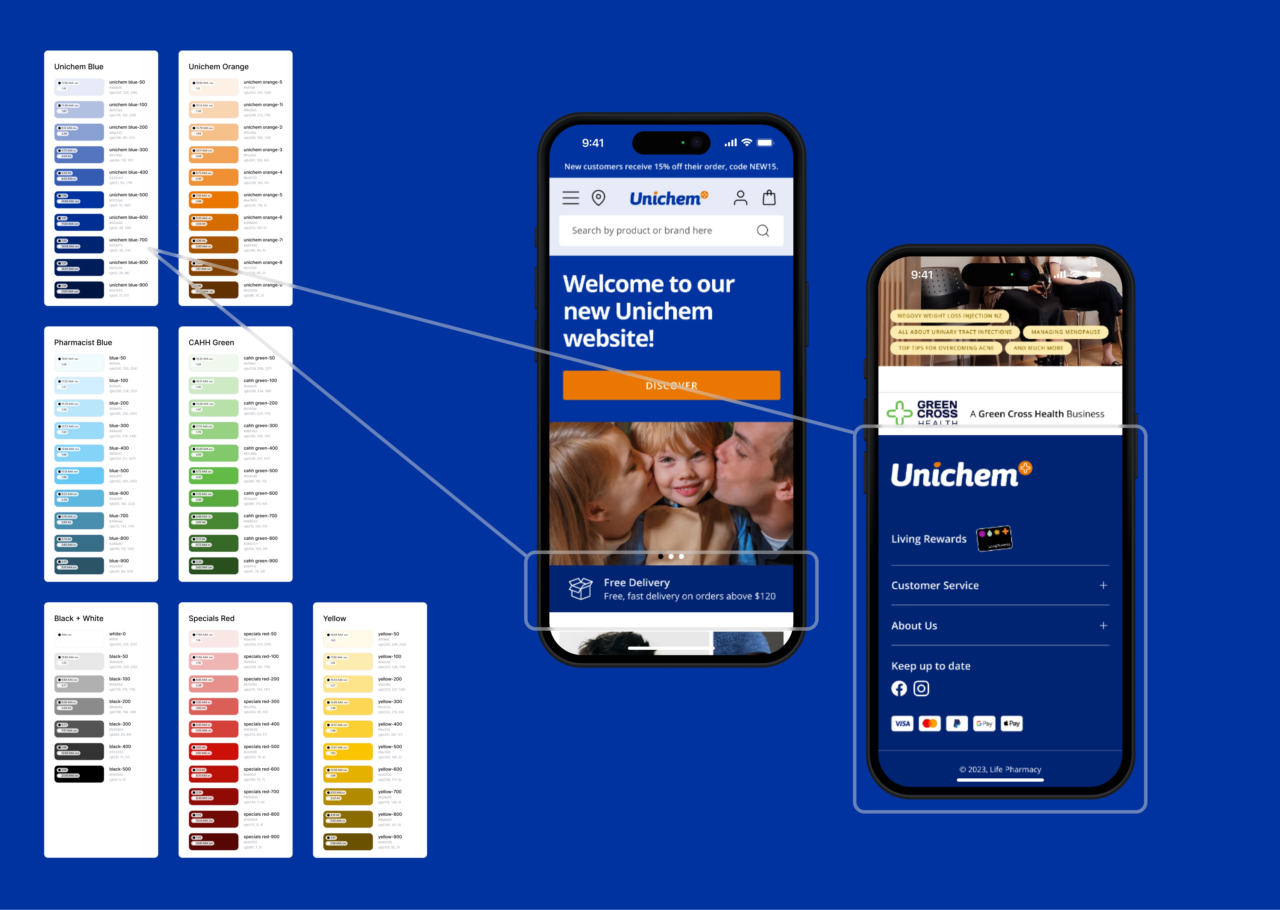
Challenge 2: A practical design system
The goal: Upgrade the design system that reflects Unichem’s community brand, while being easy for developers to recycle from Life Pharmacy's codebase.
The solution:
- I blended existing core colours with Unichem’s signature Blue and Orange, expanding them into a 10-shade palette. For example, using a darker Unichem Blue-700 for web elements allowed our promotional banners to take the spotlight.
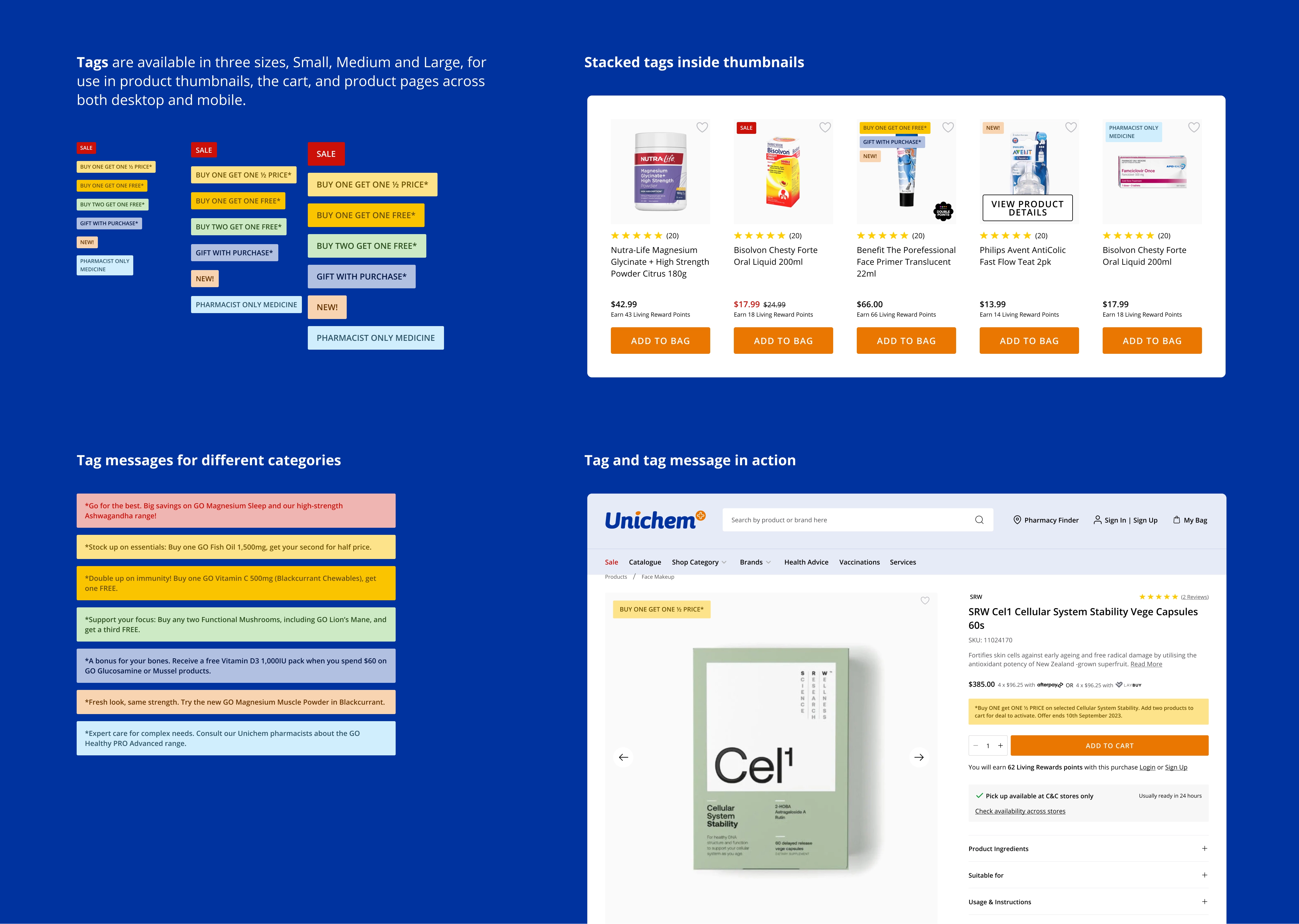
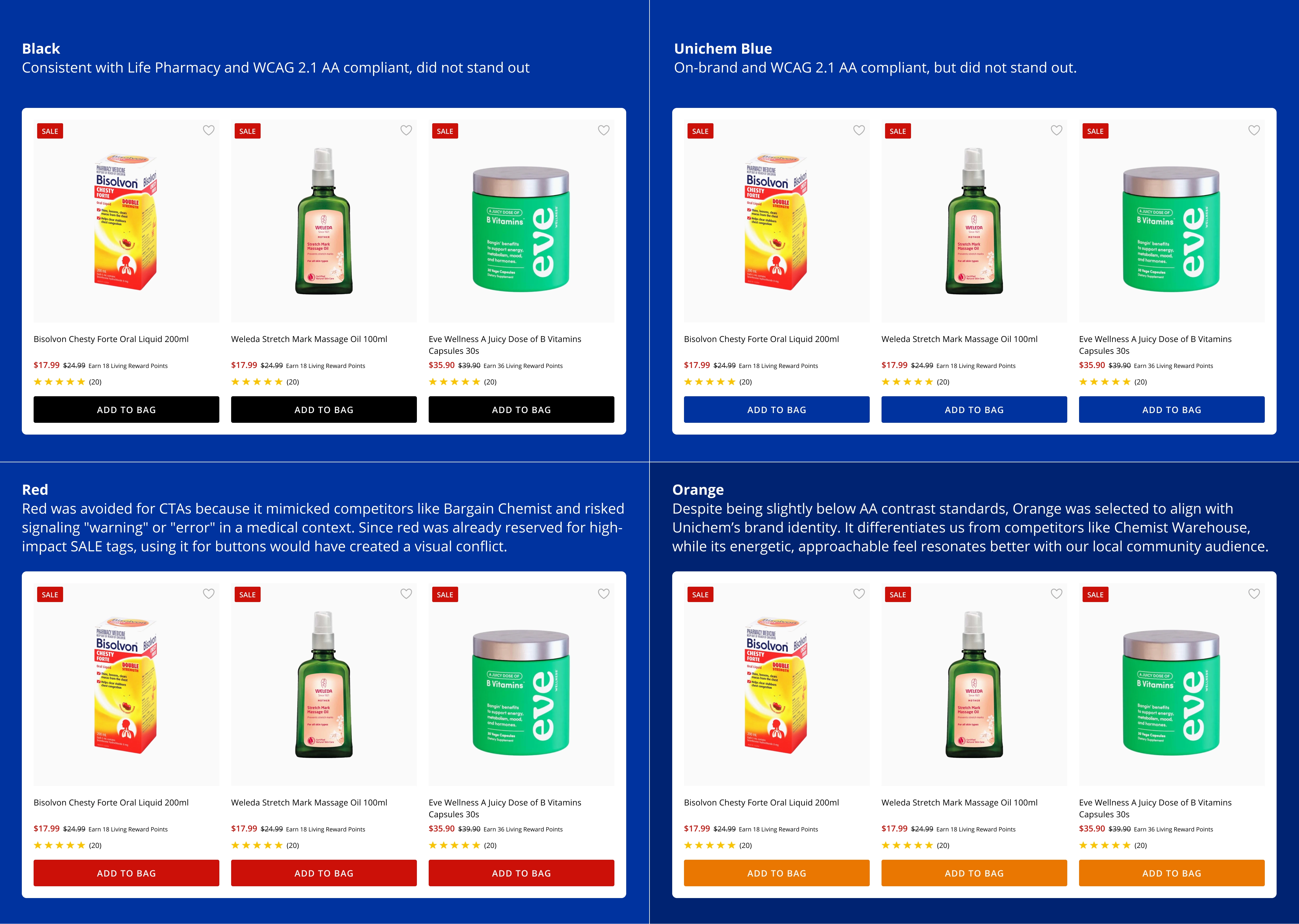
- Overhauling the tag system: Unichem customers are price-sensitive, but our old tag system was inconsistent. I standardised it so "SALE" became the hero message—using a bold red tag with white text for maximum pop—while secondary tags were easily distinguishable at a glance.
- The CTA debate:
- Asset Reusability: We had already defined specifications for responsive banner sets across desktop and mobile, including hero banners, below-the-fold tiles, promotional cards and so on. Safe zones and layout rules had been shared with internal designers and suppliers. By reusing this system across both platforms, we reduced friction and improved production efficiency.
Challenge 3: Fast exec sign-off
The goal: Get rapid approval from a non-technical executive team.
The solution: Read the room. Instead of forcing our marketing and IT leads into a digital Figma prototype or MarkUp.io link, I went old school. I categorized the core user flows, printed the screens onto A3 paper, and handed them a pen. They loved the traditional approach, we got our feedback immediately, and the project kept moving.
Links:
https://medium.com/@cristynatann/introduce-the-power-and-paradox-of-red-in-ui-ux-0d9b7d2e66e9
Check my other projects
Let’s connect!
I’m a UX/UI designer with 4+ years of graphic and web design experience. I enjoy analysing digital products to see what works (and what doesn’t) and aim to balance user needs with business goals while keeping experiences fun to use. I’m curious, always learning, and currently exploring AI tools and front-end coding to speed up workflows.
If you’re looking for a designer who asks smart questions to solve problems, let’s connect!


