
Turners Insurance
Redesigning a text-heavy, outdated page into a guided step-by-step online quoting process that simplifies insurance for users
UX Designers and Researchers: Liam Nguyen, Shenene Carstens
Mentors: Viktoria Semina, Sebin Benjamin, Corinne Davies
3 weeks
Mission Goal
Modernise Turners’ car insurance flow to reduce friction, increase online conversions, and strengthen customer confidence in self-service.
Business Context
Turners is a New Zealand auto retailer offering vehicle sales, finance, and insurance in partnership with Autosure. Its insurance range includes Mechanical Breakdown and standard car cover, with add-ons like roadside assistance and replacement vehicles. However, customers can’t get quotes or purchase insurance fully online — a major friction point in an era where 68% of insurance buyers globally prefer to transact digitally (The Digital Insurer). This gap represents both a growth opportunity and a churn risk.
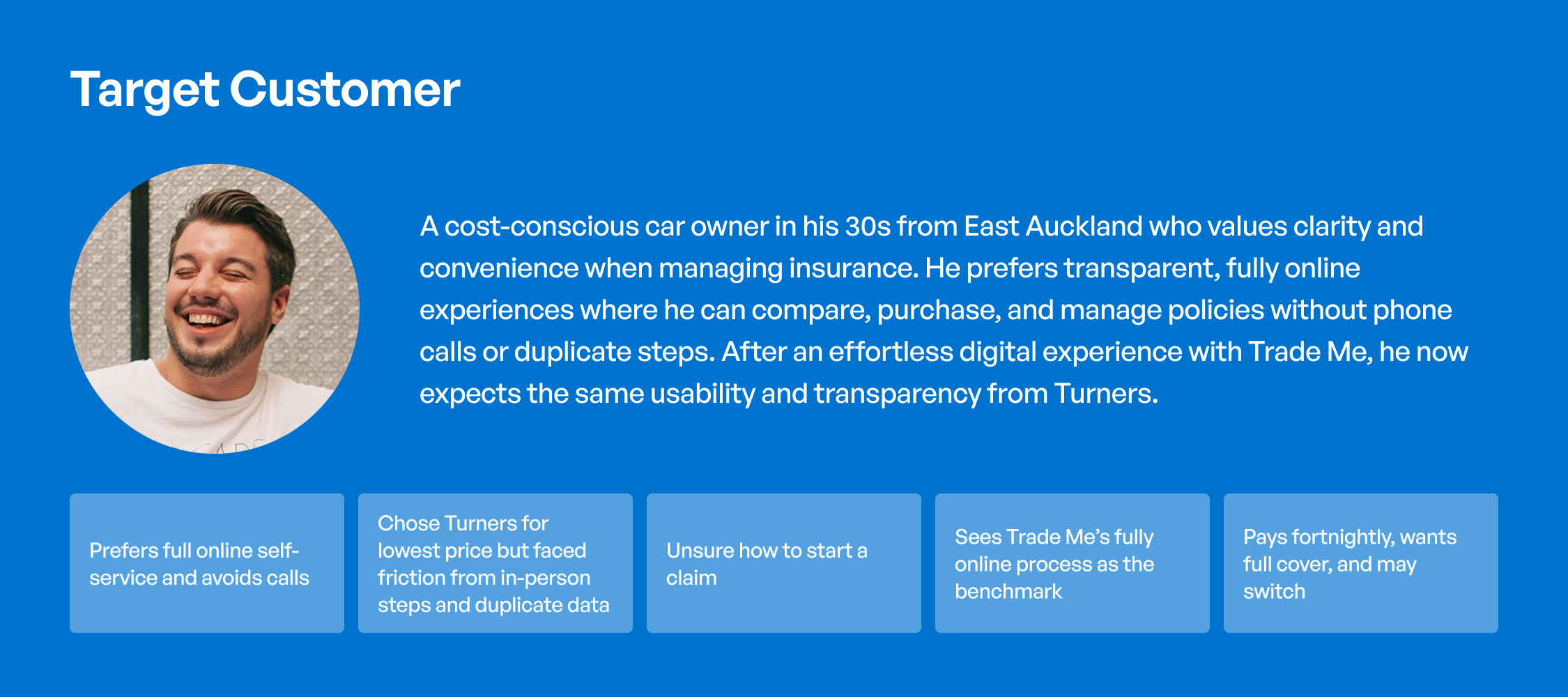
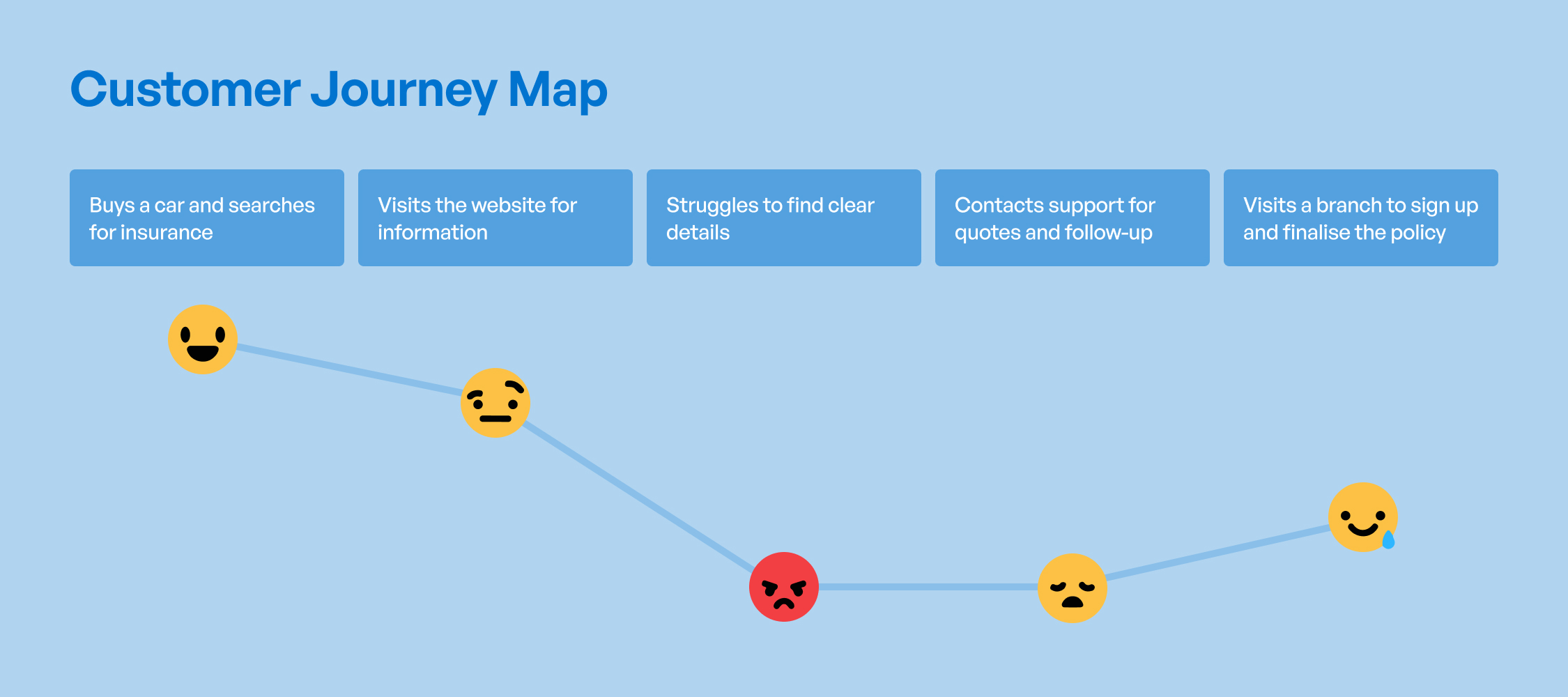
Understanding the Customer
Reframing the Opportunity
Problem statement
Customers who value transparent, self-service insurance face friction in Turners’ current journey — no visible calculator, back-and-forth emails, and in-person finalisation — leading to uncertainty about coverage and higher switching likelihood.
Opportunity
Simplifying the process would not only ease customer effort but improve conversion rates and retention, lowering support costs and differentiating Turners from competitors.
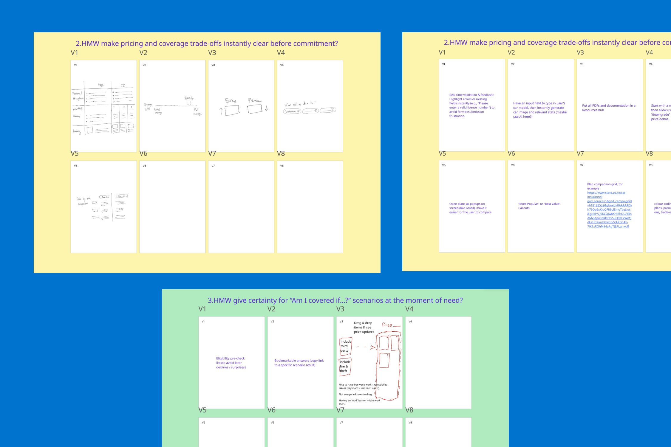
How we find the right ideas
By using multiple ideation methods including Crazy 8s, we narrowed down to a few effective solutions that aligned with user needs.
Shaping the Solution
Our concept
Concept: Confidence-First Quote Builder: A streamlined quoting tool designed for clarity, predictability, and ease
Key design elements
Validating and Action though Testing
Remote moderated usability sessions by measuring clarity, effort, and task success on the prototype, using the following metrics:
- SEQ (Single Ease Question)
- CES (Customer Effort Score)
- SUS (System Usability Scale)
- Success %, mean time per task
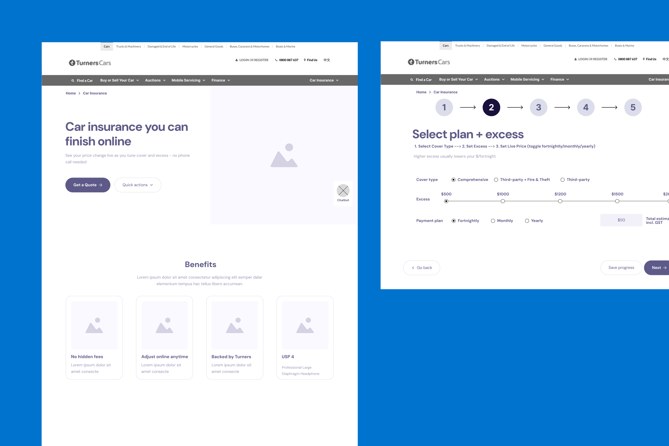
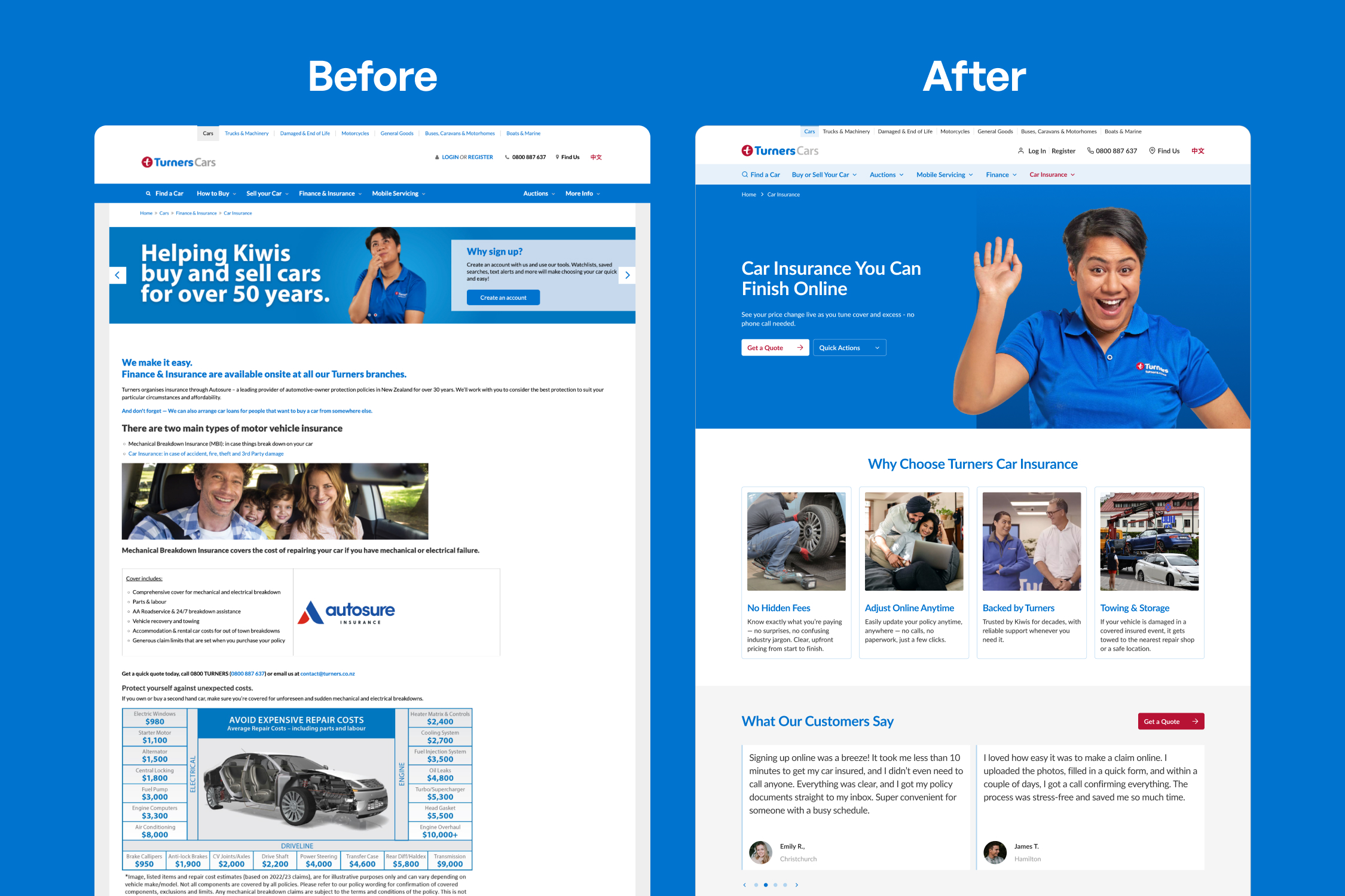
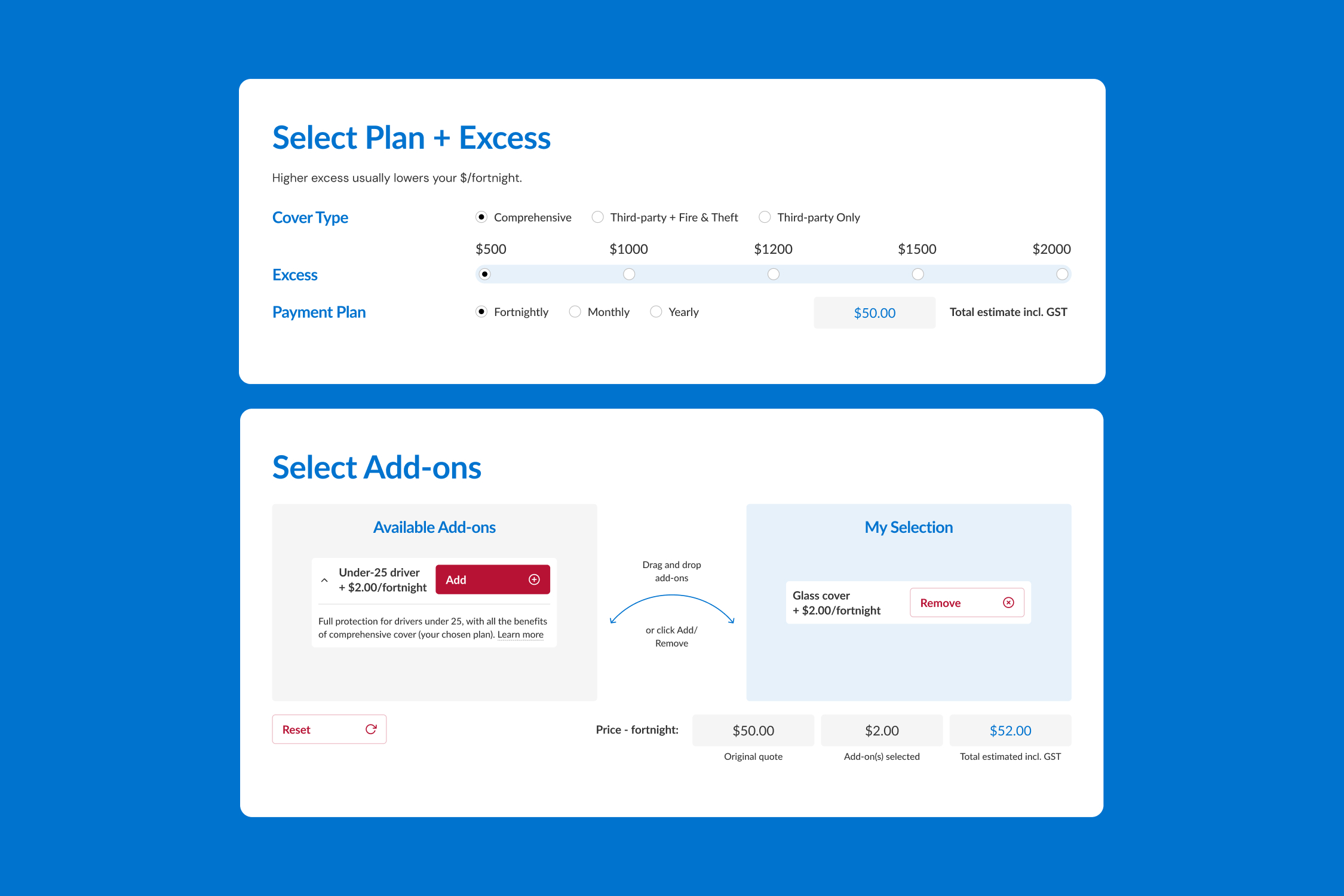
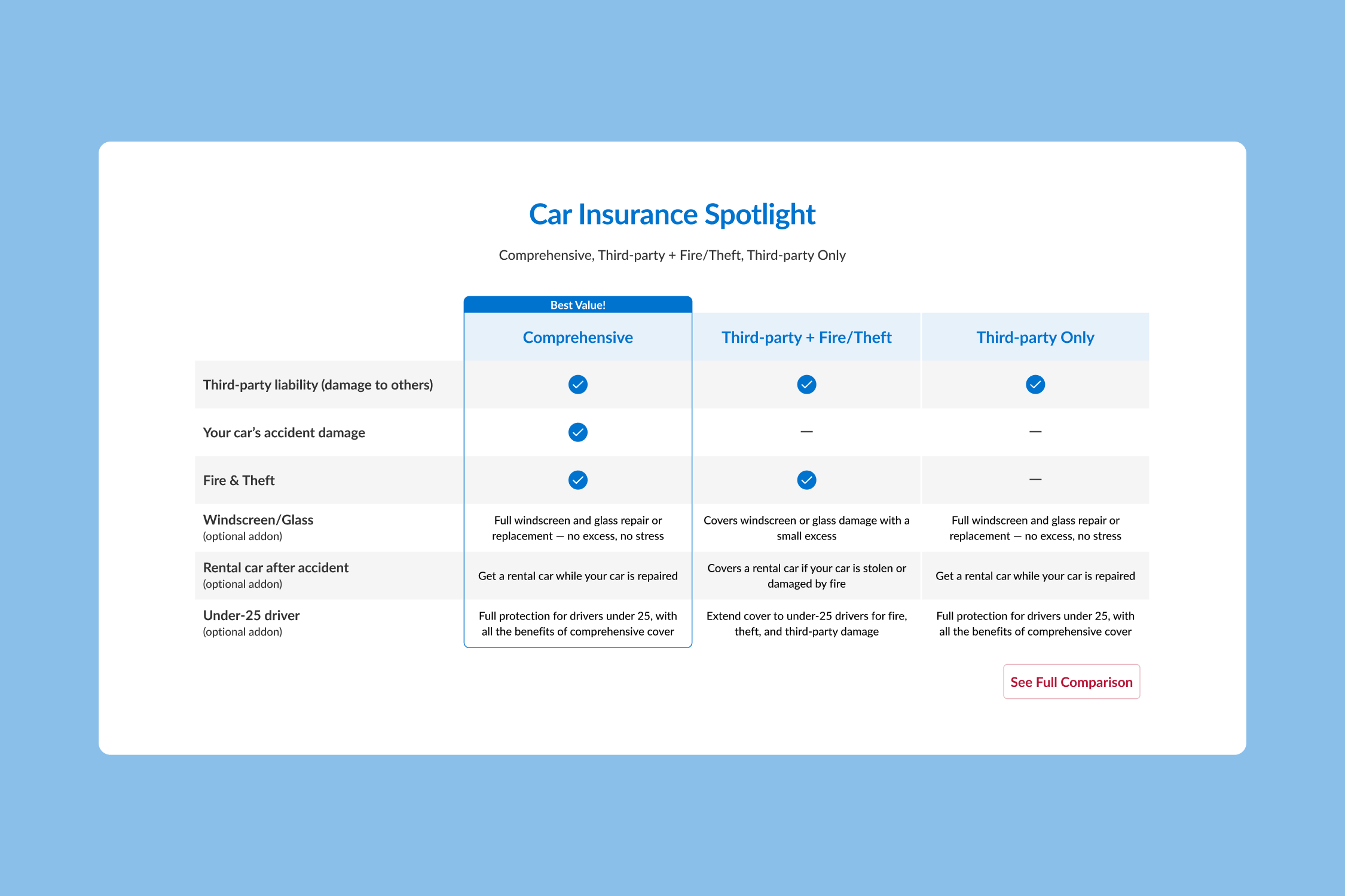
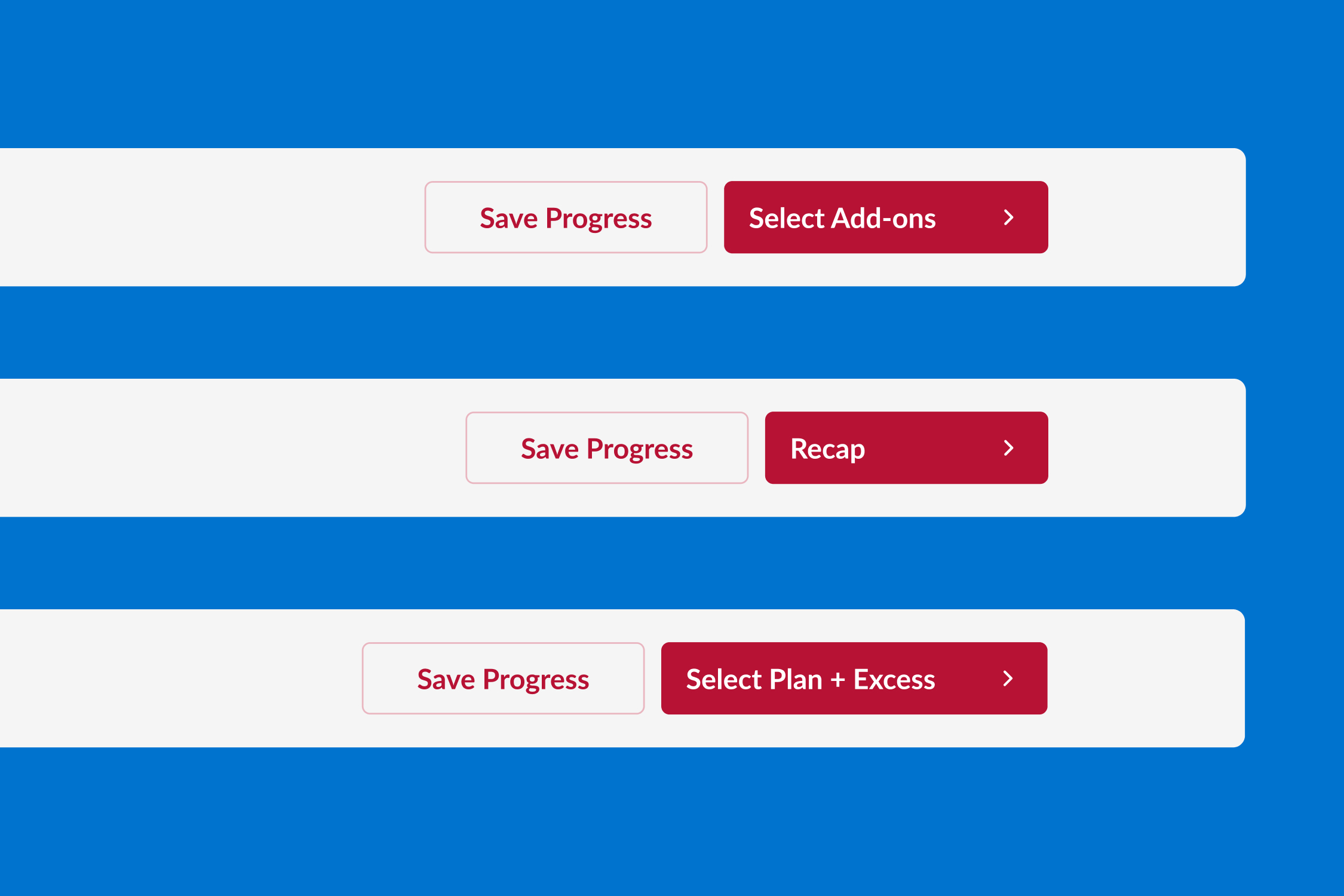
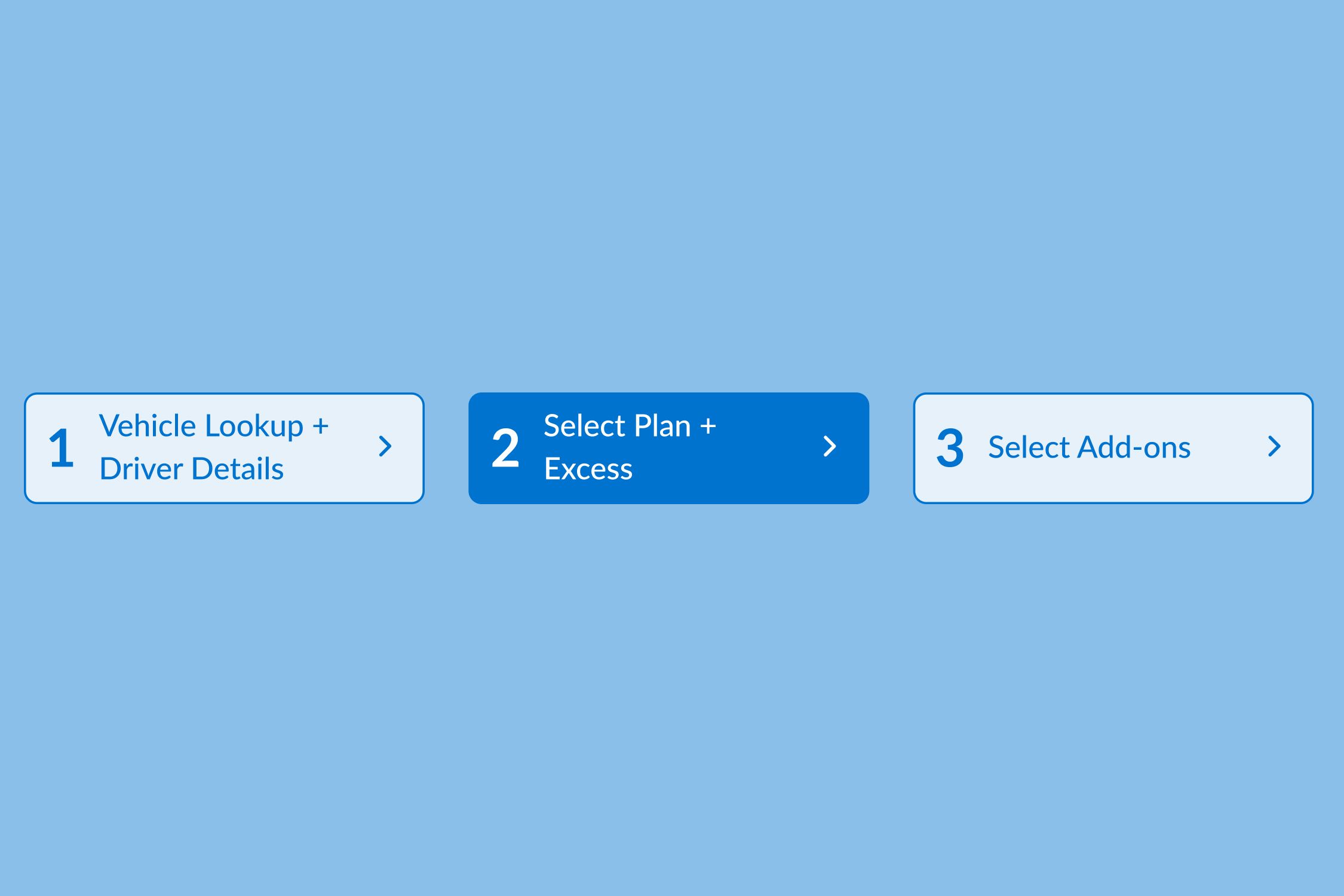
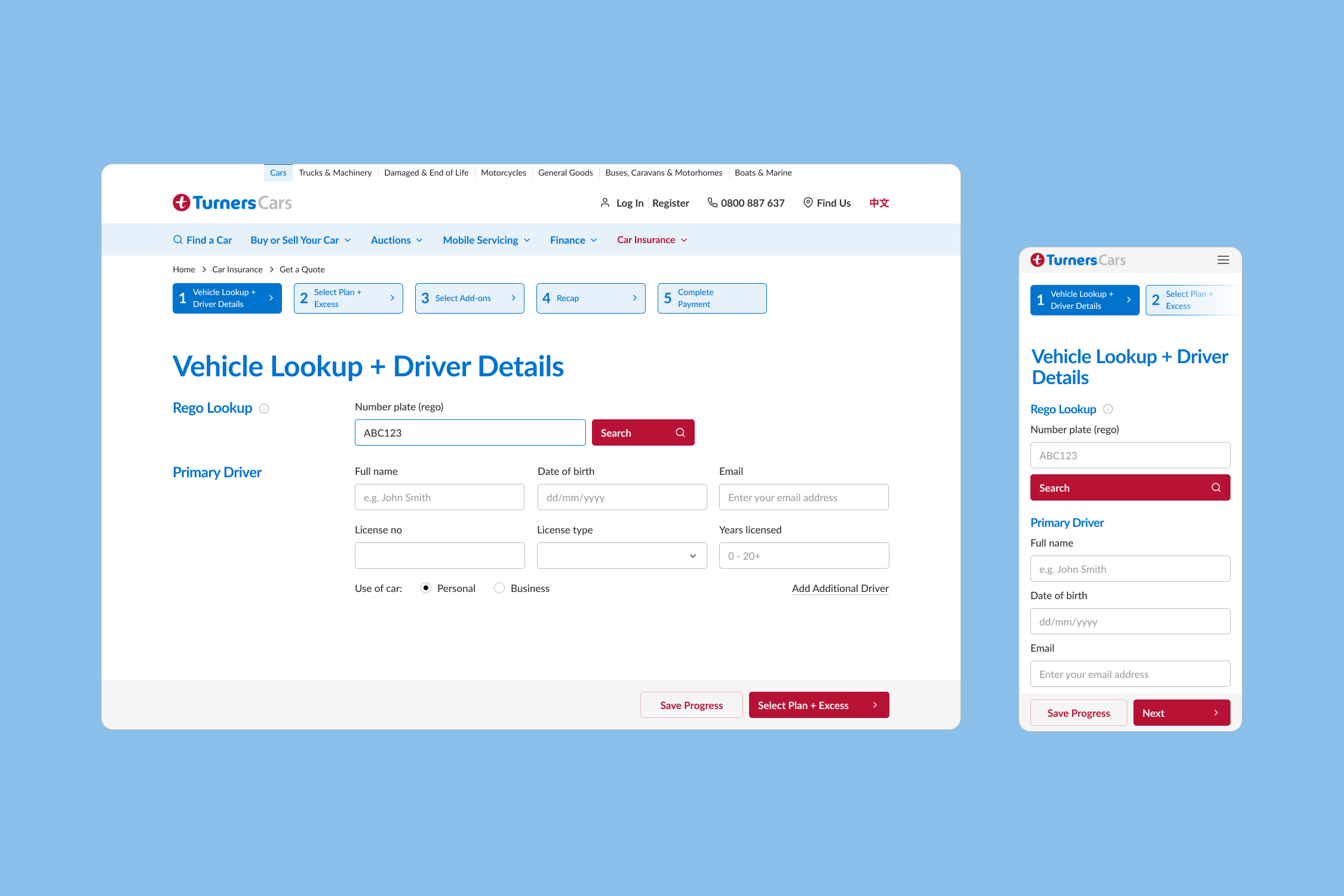
The Final Design
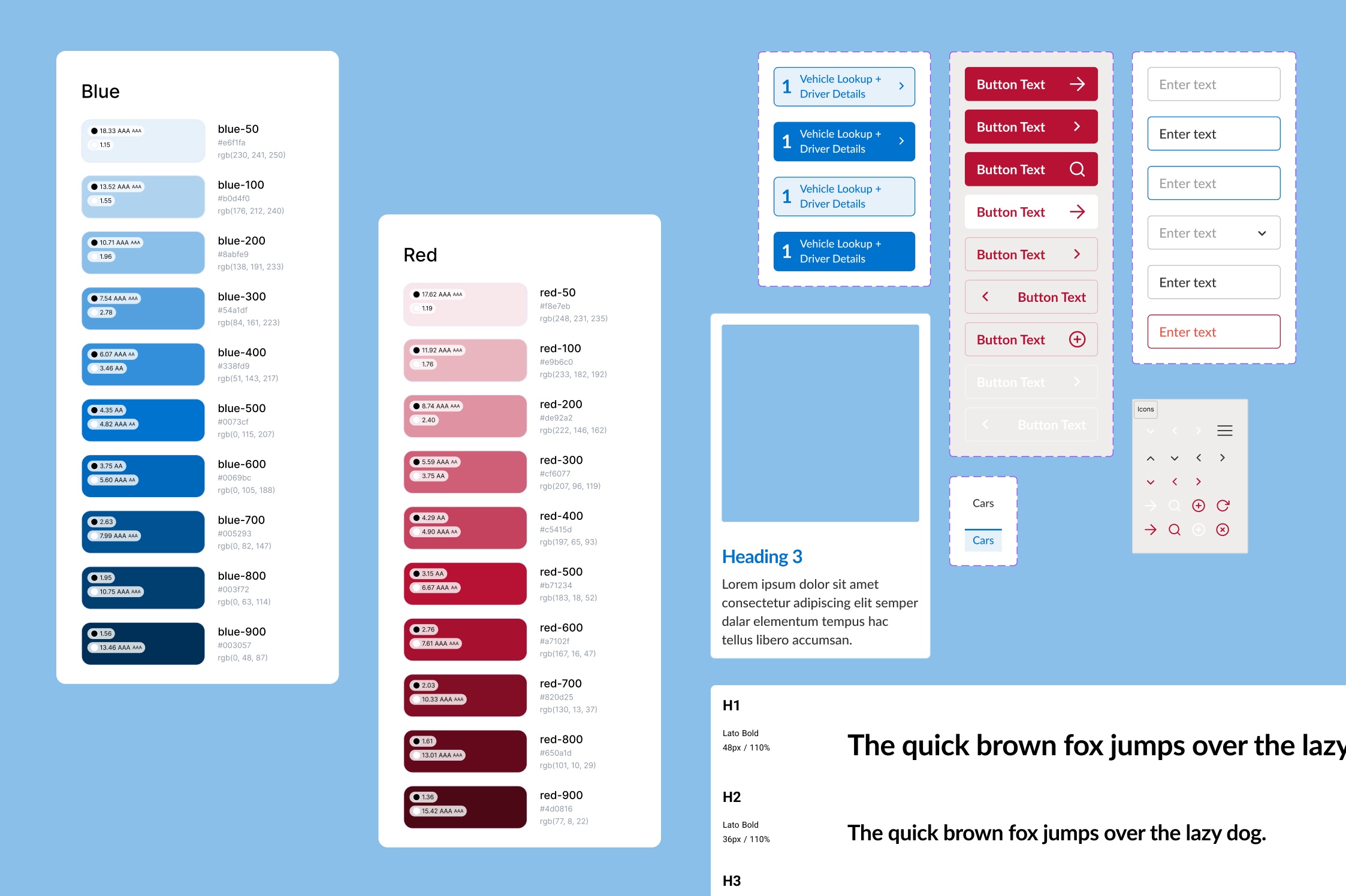
Some snippets of our website. The biggest challenge with creating the high-fidelity mockup was to upgrade and innovate the current look and feel, which is outdated and cluttered. We successfully solved the issue by crafting an extensive design system with more variations of fonts, colours and components, which are used strategically across the pages.
Reflection
Biggest Challenge:
Balancing clarity for customers with the amount of insurance content and business constraints.
Key Learning:
Usability testing is not just about user satisfaction — it’s a strategic decision tool for improving ROI and digital conversion.
Next Step:
Re-test refined flow with new participants and integrate real-time calculator logic.
Check my other projects
Let’s connect!
I’m a UX/UI designer with 4+ years of graphic and web design experience. I enjoy analysing digital products to see what works (and what doesn’t) and aim to balance user needs with business goals while keeping experiences fun to use. I’m curious, always learning, and currently exploring AI tools and front-end coding to speed up workflows.
If you’re looking for a designer who asks smart questions to solve problems, let’s connect!


