
PolicyCheck
Designing a scalable design system for campaigns and policy data visualisation
Developers: Dhanisha Harshad, Tommy Goodman;
Data Analyst: Vishakha Patel;
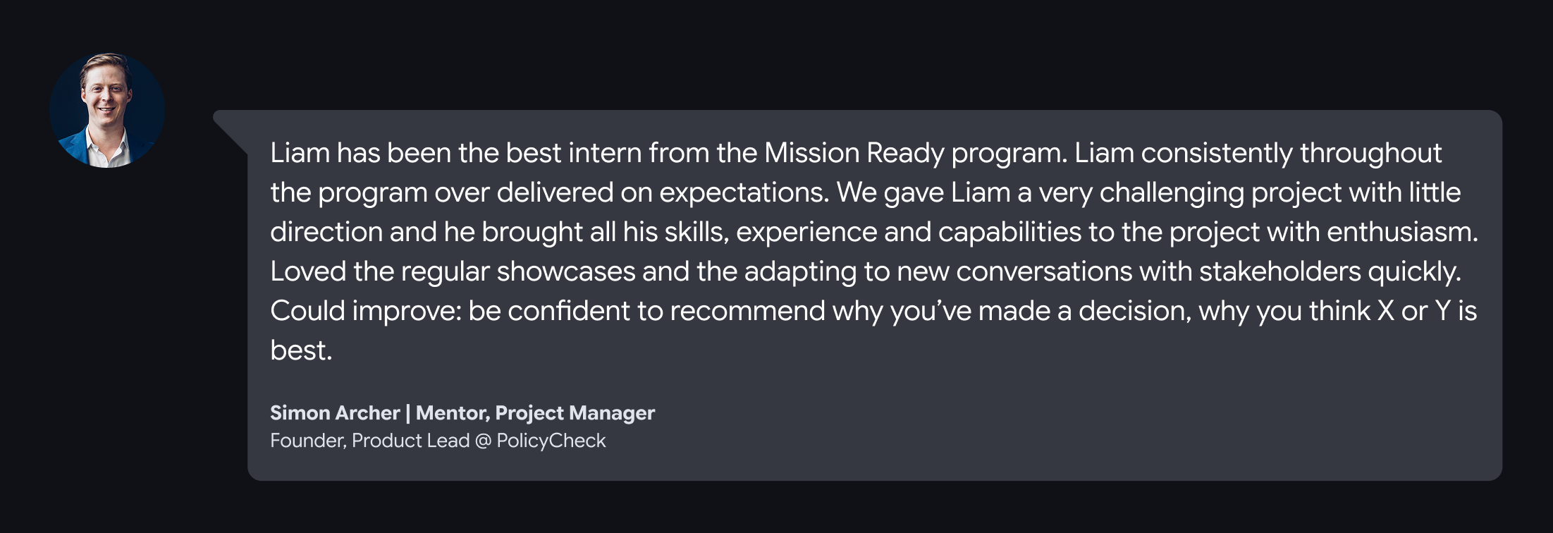
Project Manager: Simon Archer;
Founders and other stakeholders: John Peters, Andrew Clouston and more
5 weeks
1. Introduction
PolicyCheck is an AI-powered platform that helps insurance brokers deliver faster, clearer, and compliant advice in a complex, fast-changing policy landscape. Brokers deal with dense wording, frequent policy updates, and hidden exclusions under time pressure, which makes it easy to default to familiar products instead of the best cover for each client.
This case study focuses on how I improved the product UX by establishing scalable design foundations and applying them to two key areas:
- Campaigns: set up client email campaigns powered by automation and templates, so brokers can communicate with trust, efficiency, and confidence.
- Policy Dashboard: a clear, structured overview of policies split by categories and decision factors, designed for faster comparisons and better oversight.
For a deeper look at the target user and their pain points, see my other PolicyCheck case study on the “Create with AI” feature.
2. Mission
Supported by a lightweight design system, my work aimed to deliver value on three levels:
- For brokers
- Minimise manual admin
- Strengthen communication with clients using clearer insights and better defaults
- For the team
- Build a foundation that scales for future features
- Make it easier to implement with clean, reusable HTML/CSS patterns
- Reduce ambiguity for developers and future designers taking over
- For me
- Establish an AI-assisted workflow that fits a fast-paced startup environment
- Present clear MVPs and mock-ups to stakeholders without a design background
3. The problem
The product was growing quickly, but the UX foundations were not keeping up.
- No design system
- Inconsistent colours, typography, iconography, spacing, and component behaviours
- Repeated design decisions slowed iteration and increased handoff ambiguity
- Accessibility gaps
- Several UI elements did not meet WCAG contrast requirements
- Feature maturity gaps
- Campaigns tab was early-stage and surfaced errors, with unclear information architecture
- Policy Dashboard did not exist yet
- Existing “Policy Research” table was difficult to scan, lacked summaries, and did not support faster decision-making (no trends, no highlights, no clear hierarchy)
4. Design approach
I worked through three layers.
First, I established a lightweight design system to create consistency and remove repeated decision-making.
Second, I designed and iterated the Campaigns experience, using early prototypes to align with stakeholders and technical constraints.
Third, I designed a visually engaging, responsive Policy Dashboard that makes dense policy data easier to scan, compare, and act on.
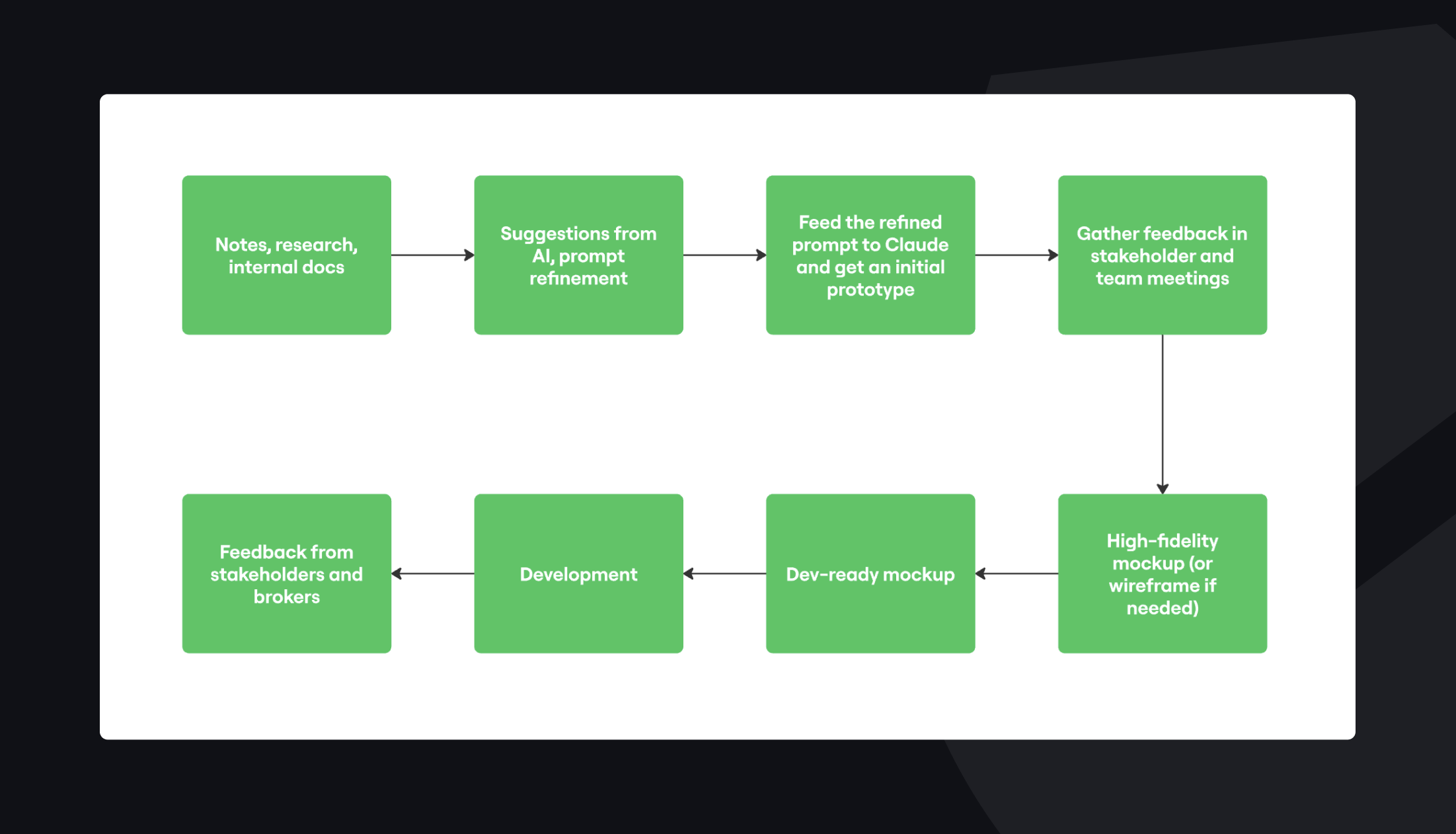
5. New AI-assisted workflow
From my learnings via a course on Design Thinking, I introduced a workflow that treated AI like a junior teammate: useful for speed and brainstorming, not a final answer.
6. Establishing a design system
Core components
I focused on high-impact components that could be reused across features:
- Buttons
- Primary, secondary, tertiary
- With and without icons
- Clear states: default, hover, pressed, disabled
- Tags and dropdowns
- Contextual tagging
- Colour-coded by meaning, not decoration
- Interaction rules: when clickable vs informational only
- Icon set
- Consistent stroke style and sizing
- Designed around common product actions
- Action bar pattern
- Primary actions grouped to the right
- Secondary or tertiary actions grouped to the left
- Layout aligned with a Z-shaped scanning pattern
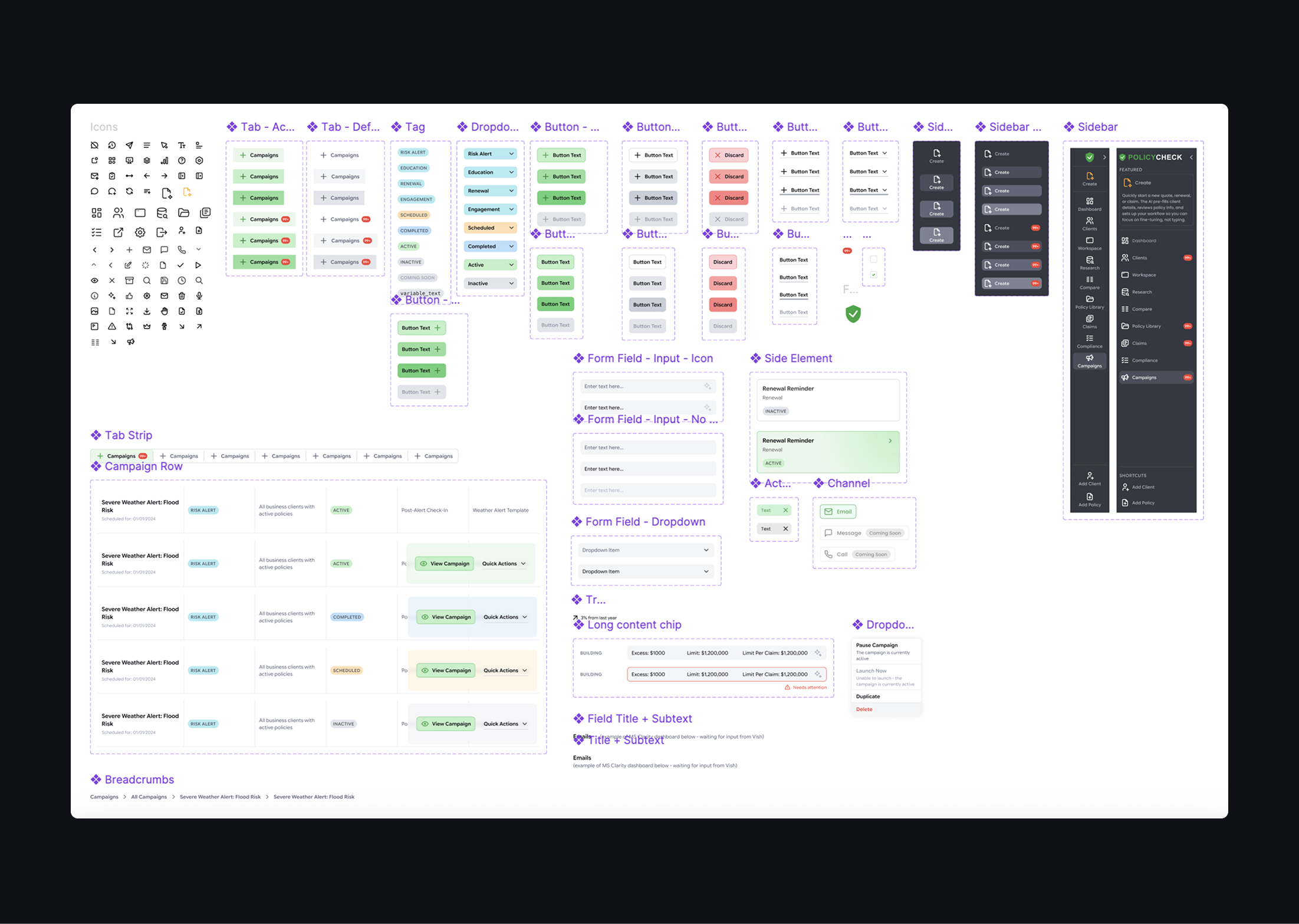
Visual design elements
To make the product feel more modern and engaging without harming clarity:
- Placeholder illustrations for “coming soon” features, so empty states felt intentional
- Glass blur panels for layered UI
- White fill at 68% opacity
- Background blur at 12 for readability and depth
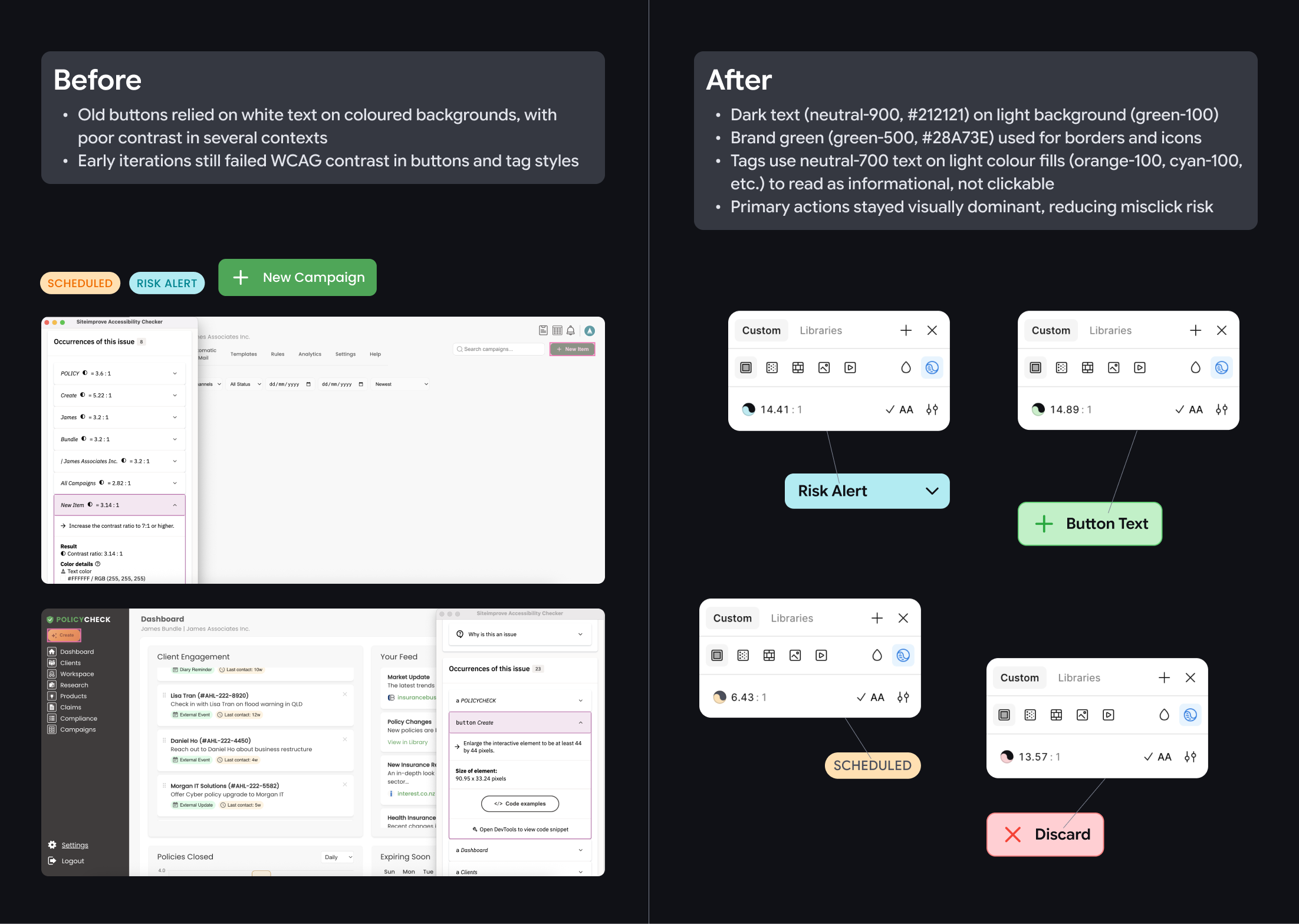
Tackling design challenges
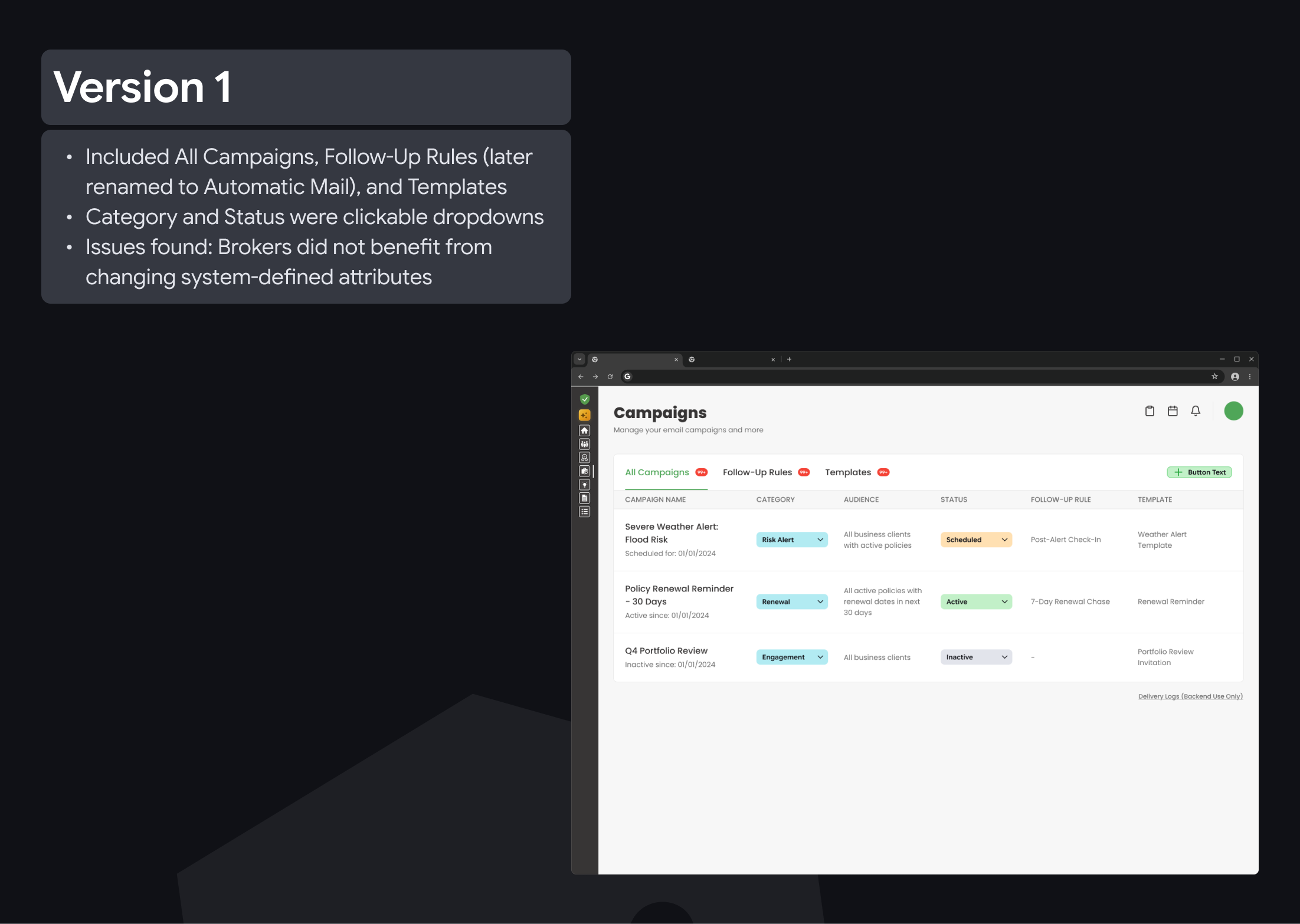
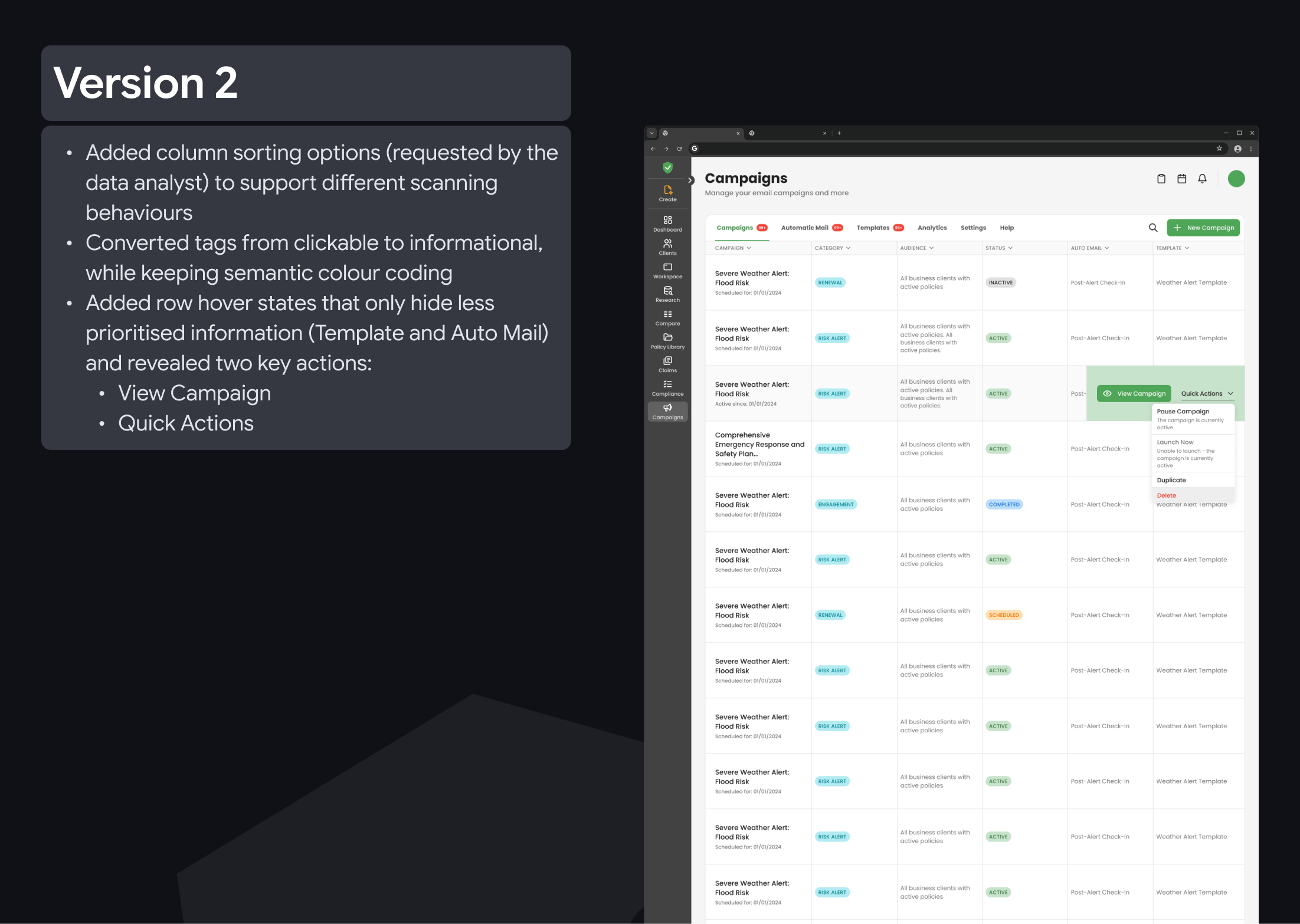
- Fixing contrast and accessibility: Old buttons relied on white text on brand green, with poor contrast in several contexts. Early iterations still failed WCAG contrast in buttons and tag styles. Therefore, my final approach has addressed those issues with the following changes:
- Dark text (neutral-900, #212121) on light surfaces (green-100)
- Brand green (green-500) used for borders and icons
- Tags use neutral-700 text on light colour fills (orange-100, cyan-100, etc.) to read as informational, not clickable
- Primary actions stayed visually dominant, reducing misclick risk
- Refreshed branding: I refreshed the brand look by moving beyond “green + dark grey” to a more functional colour palette, using colours to signal meaning while staying easy to read. I also refined colour tones so they remain clear across the UI, and explored a more UI-friendly typeface (Google Sans Flex) instead of the original typeface Poppins to improve readability in dense layouts and small text, where product screens need clarity more than marketing-style impact.

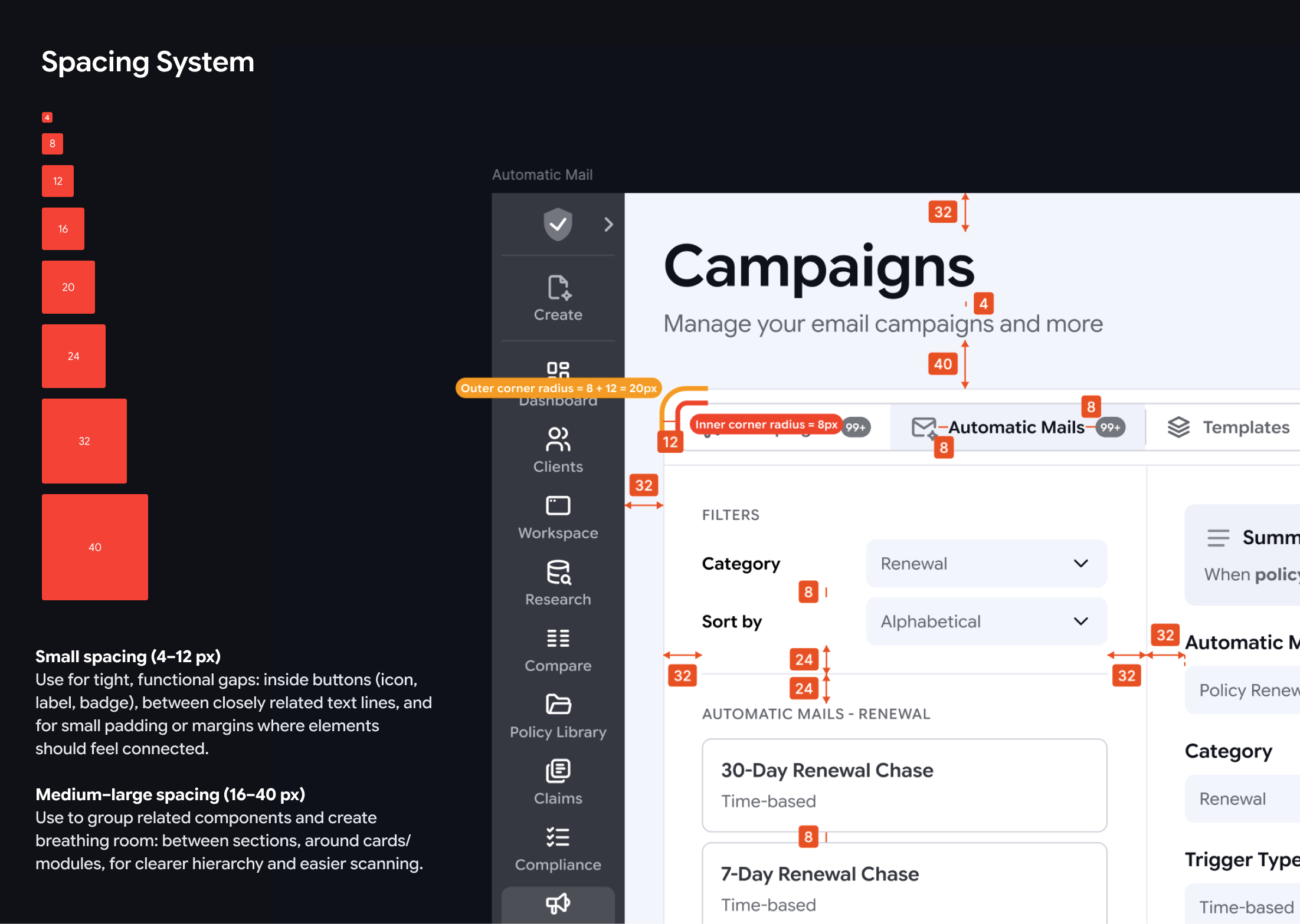
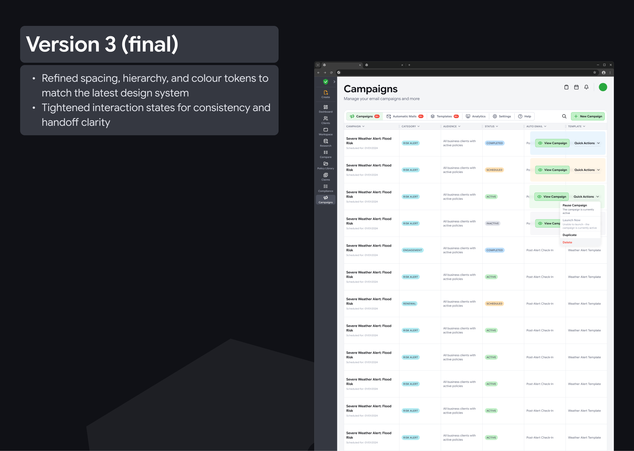
- Spacing and corners: I introduced a 4px spacing system and calculated corner radius to reinforce content grouping and make layouts easier to scan.
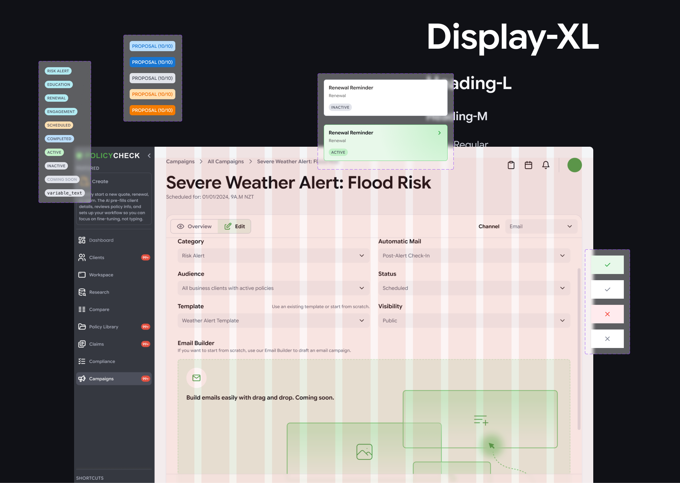
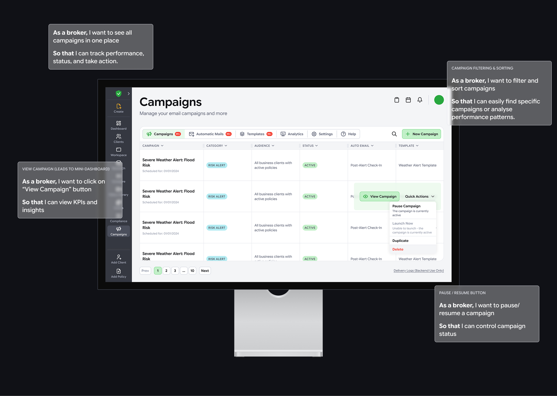
7. Feature design: Campaigns
Goal
Create a Campaigns area that works as a control centre for client communication, with scalable foundations for automation, templates, and analytics.
Design Thinking focus
Given tight timelines and early feature maturity, the project manager and our team prioritised the later stages:
- Ideate
- Rapidly explored IA and UI patterns
- Captured key constraints, required data, and user actions
- Listed down functional and non-functional requirements for details of the design (done by the data analyst)
- Prototype
- Used quick mock-ups to align on direction before high-fidelity polish
- Test and iterate
- Validated assumptions through stakeholder review and broker feedback loops.
- Iterated design based on updated user stories from the data analyst
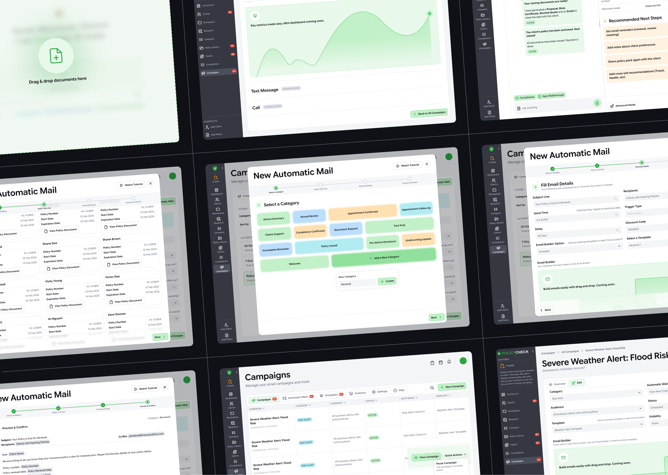
Plugins and rapid prototypes
To avoid building a campaign engine from scratch, the team evaluated plugin combinations across:
- Campaign delivery (email, SMS, calls - email to begin with at this stage)
- Analytics and dashboards
- Email builder options
We considered tools like SendGrid, Mailchimp, Metabase, and Power BI, but needed something budget-friendly and highly customisable given our in-house dev capacity. Finally, we chose Listmonk, a self-hosted newsletter and mailing list manager with automation-friendly APIs, so we could keep control of data and delivery logic while building custom UI and workflows.pp
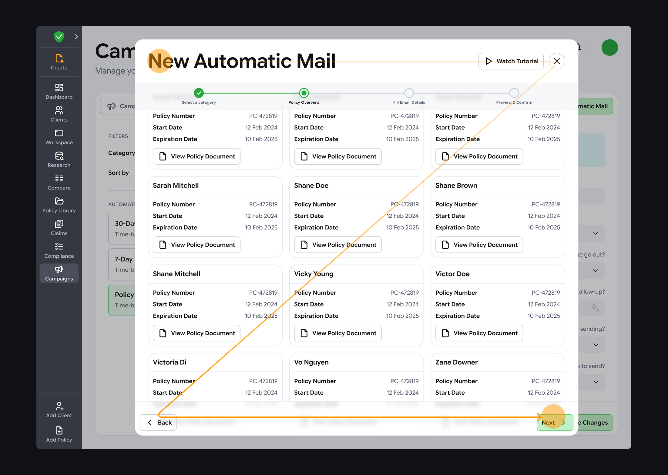
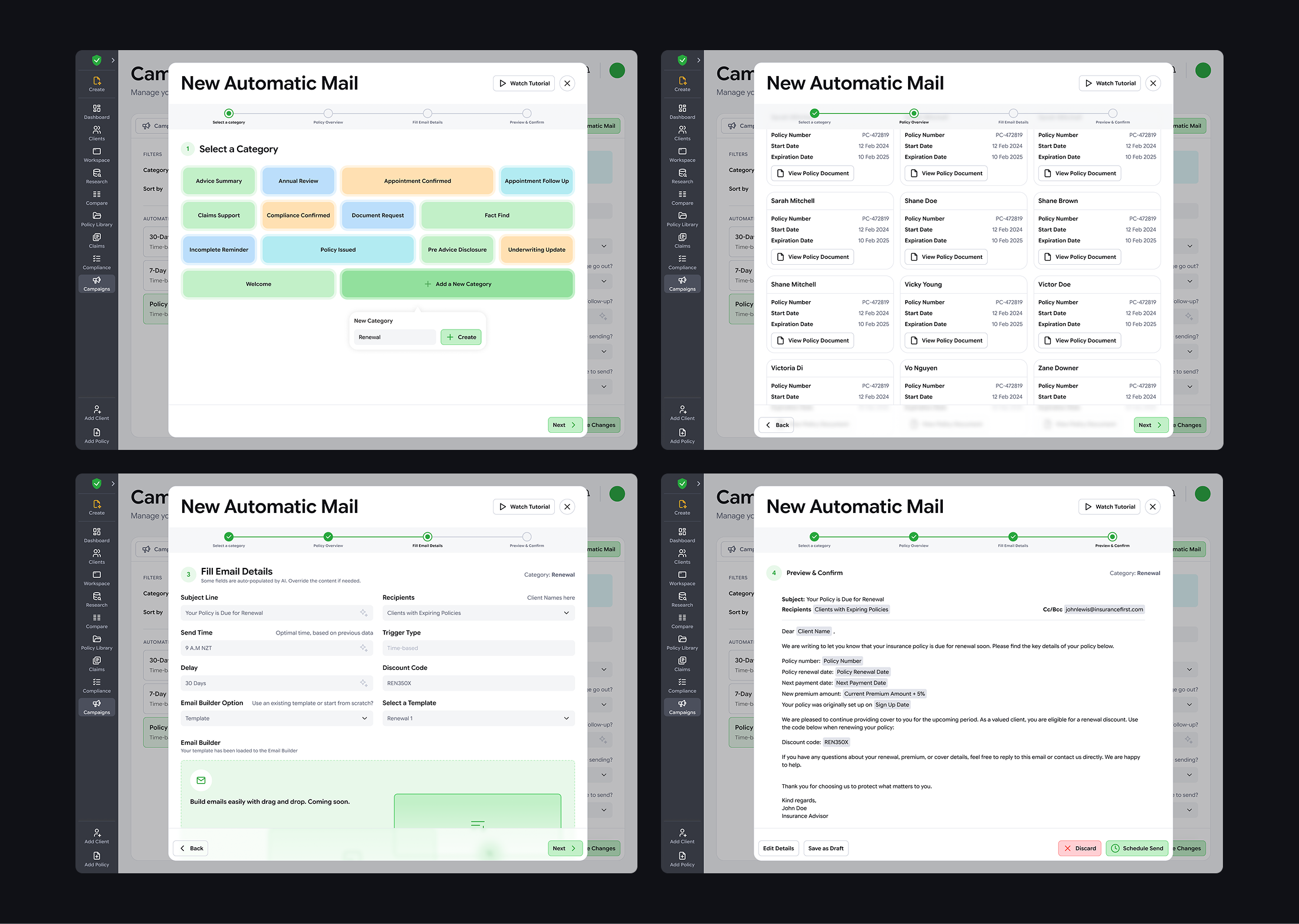
Once we chose the platform, I made some “quick-and-dirty” Claude prototypes to help non-design stakeholders see how the features would work. Instead of traditional monochrome Figma wireframes and time-consuming prototyping, I used faster AI prototypes to save the team time, bring something to every daily showcase, align earlier, and help the data analyst define functional and non-functional requirements. From there, I iterated the design to fit broker needs, business goals, and tech limits.
Design evolution
8. Automatic Mail logic
Automation needs to be powerful without removing human control, especially in compliance-heavy workflows.
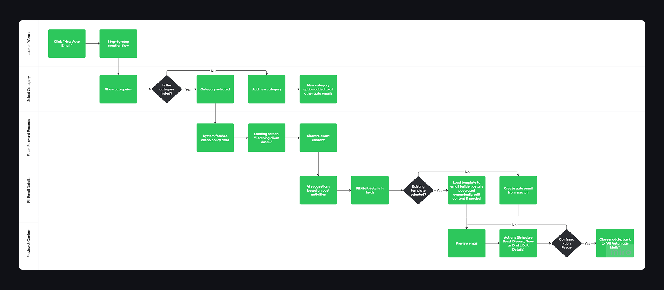
Key learning: swimlane diagrams made multi-stage flows easier to reason about.
- Clarified what is automated vs manual
- Identified where brokers must stay in control
- Defined fallbacks for AI uncertainty or failures
- Reduced the risk of over-automation and improved trust
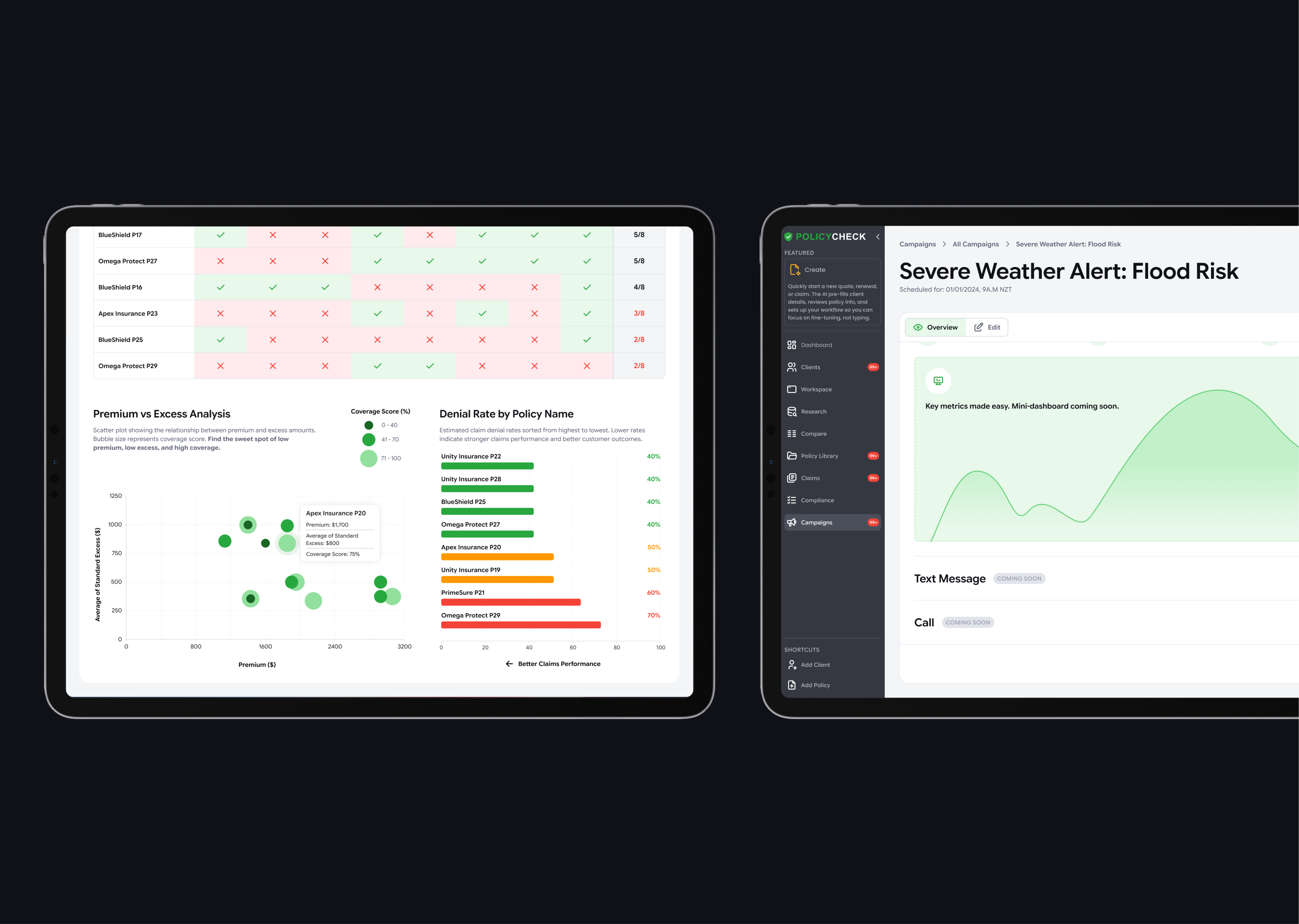
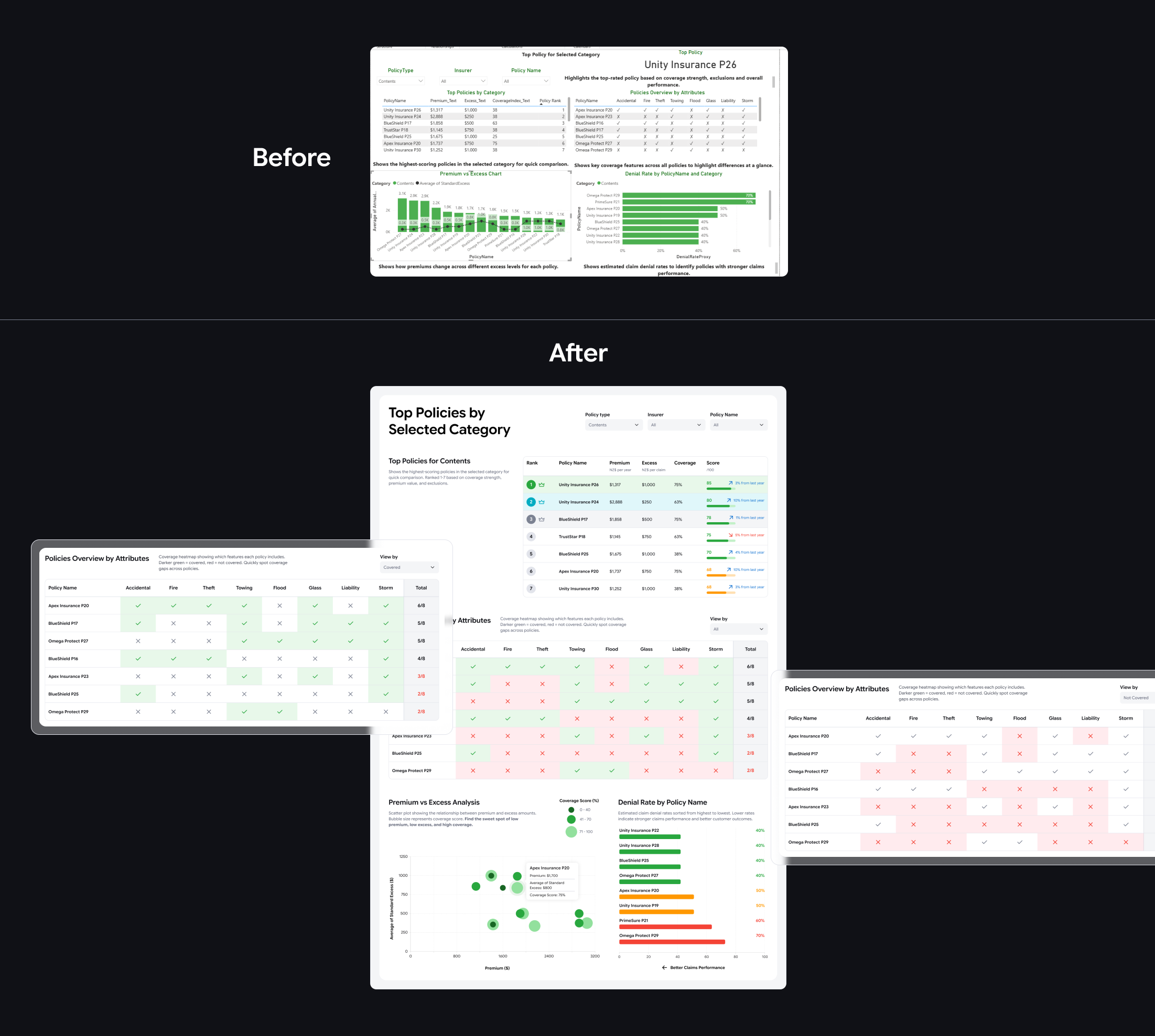
9. Policy Dashboard
This dashboard helps brokers compare policies across categories (for example Home, Contents, Vehicle) and spot the best options for clients. It also gives managers a quick view of category performance and trends over the years.
I used the data analyst’s Power BI dashboard as a starting point, then improved the responsive layout and clarity for real screen use, built for scrolling, clicking, and hover states. Colours follow the design system, with greens and blues for positive signals and reds or oranges for risks.
For premium vs excess vs coverage, I used a scatter plot with different dot sizes instead of a bar-line chart. It makes the trade-offs easier to see, and highlights the “sweet spot” of low premium, low excess, and high coverage.
10. Next steps
I am still waiting for shareable, measurable outcomes from the company. When creating the design, some decisions were guided by heuristics such as “Match between system and the real world” (UX copy) and “Recognition rather than recall” (dropdowns and autofill); therefore, the next step is to test these with real users to confirm they work in practice. Other than that, some metrics and user validation I would consider for the next stage include:
- Time saved for brokers
- Reduction in manual follow-ups
- Engagement improvements in campaign performance
- Faster policy comparison and decision confidence
- Can they complete key tasks faster?
- Do the dashboards reduce re-checking and second-guessing?
- Are automation controls trusted and understood?
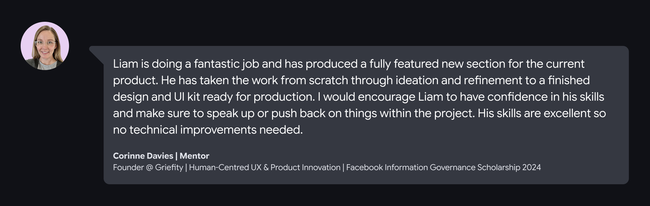
11. Messages from my mentor and project manager
Check my other projects
.webp)
Let’s connect!
I’m a UX/UI designer with 4+ years of graphic and web design experience. I enjoy analysing digital products to see what works (and what doesn’t) and aim to balance user needs with business goals while keeping experiences fun to use. I’m curious, always learning, and currently exploring AI tools and front-end coding to speed up workflows.
If you’re looking for a designer who asks smart questions to solve problems, let’s connect!


