
BirkAds
End-to-end website design and Webflow development for a high-performing Facebook ads agency
Client: Madis Birk (BirkAds)
Web Designer and Webflow Developer: Liam Nguyen
Project Manager, Creative Director: Karl Mony
3 months for the initial stage, 2 more months for Resource pages
1. Overview
At Fujee Design Studio, I had the opportunity to leverage my skills and creativity for birkads.com—an elite platform for Facebook advertising aimed at ambitious green outdoor brands. Our product development process followed a proven framework: research, wireframing, high-fidelity mockups, Webflow prototyping, and testing, all enriched by a variety of engaging challenges and valuable insights.
2. About the agency
Background
Over the past decade, Madis Birk has assisted hundreds of high-growth brands in enhancing their sales through exceptional advertising campaigns. In addition to serving as a consultant for Hootsuite, the world’s largest advertising platform, AdEspresso, and Madgicx, he also coaches billion-dollar companies and individuals. Now, driven by a passion for the creative aspects of paid media, Madis has established BirkAds—a growth partner focused on developing Ad Creative Research (ACR) systems specifically for green outdoor brands.
Target audience profiles
BirkAds positions itself specifically as an expert for the outdoor industry, moving away from "generalist" agency models to serve a niche.
- Outdoor Brand Owners & CEOs: Leaders of companies selling hiking gear, camping equipment, technical apparel, or adventure sports goods.
- E-commerce Managers (DTC): Professionals at Direct-to-Consumer (DTC) outdoor brands who are responsible for scaling online sales via Shopify or similar platforms.
- Marketing Directors of Mid-to-Large Outdoor Retailers: Decision-makers who have an existing budget but are unhappy with current ROAS (Return on Ad Spend).
- Venture-Backed Outdoor Startups: New brands that have high-quality products but lack the technical expertise to navigate Facebook and Instagram’s complex ad algorithms.
Usual behaviors: What they want from the website
When these audiences visit the BirkAds site, they are generally looking for competence and industry-specific proof. These users are outcome-oriented. They look for case studies, specific "before and after" ROAS figures, and testimonials from other outdoor brand owners.
Communication: How they contact the agency
Clients in this high-ticket B2B space typically follow a "Warm Discovery" funnel:
- The Initial Audit: Most start by requesting a "Free Audit" or consultation. This allows the client to see the agency's value without an upfront financial commitment.
- Referrals & Network: Many contact the agency after seeing Madis Birk (the founder) share insights on platforms like LinkedIn or industry-specific blogs.
- Low-Barrier Messaging: Using contact forms on the Webflow site to ask a specific question about their current ad performance.
Pain points
The previous website presented several challenges:
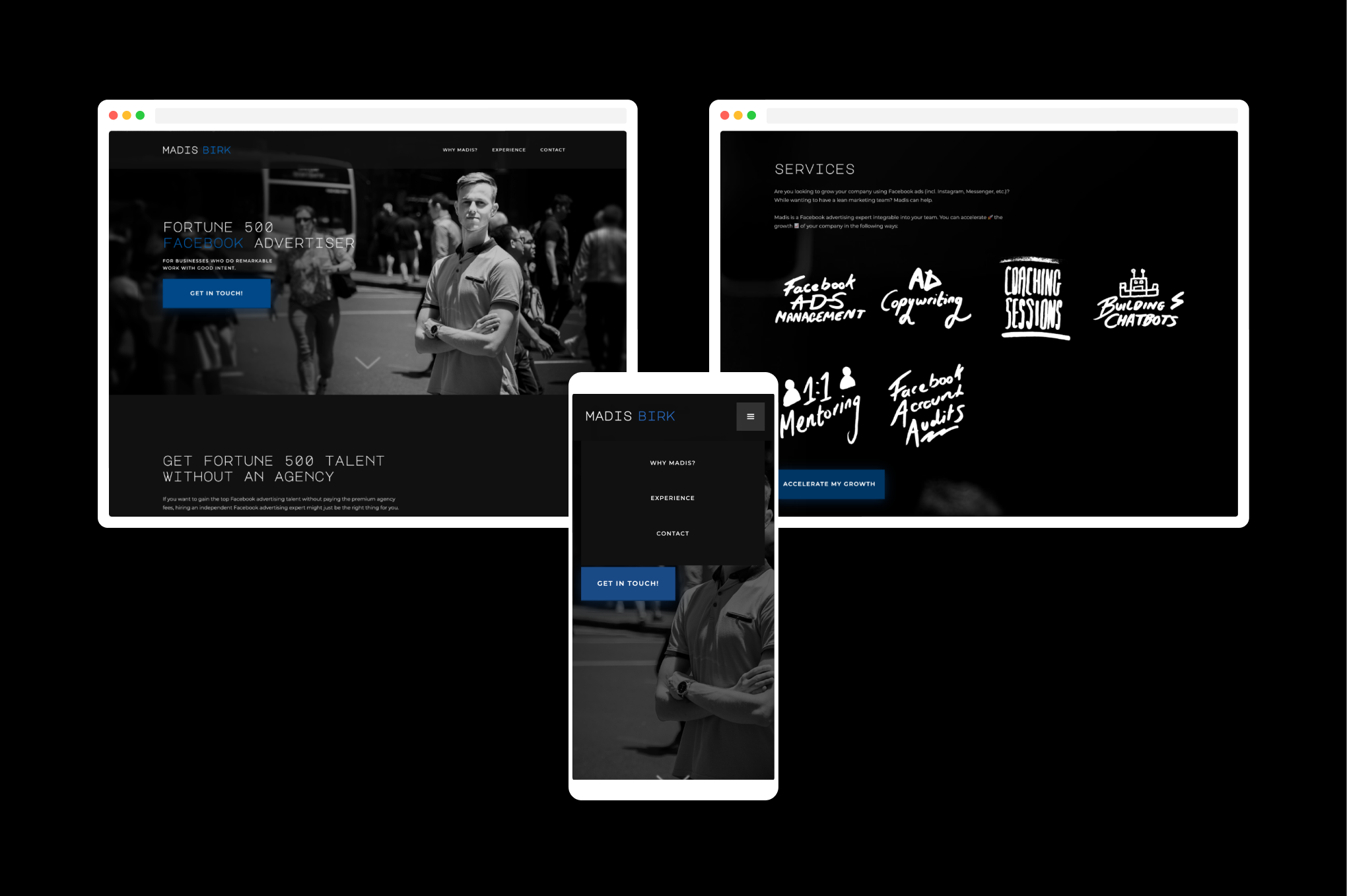
- It conveyed the impression of an individual rather than a professional team.
- The design was uninspiring for a creative agency, with mismatched typography and visual elements.
- Key sections—biography, services, and achievements—had ineffective layouts.
- Lengthy text passages risked losing reader engagement.
Addressing these issues was crucial for establishing a stronger online presence.
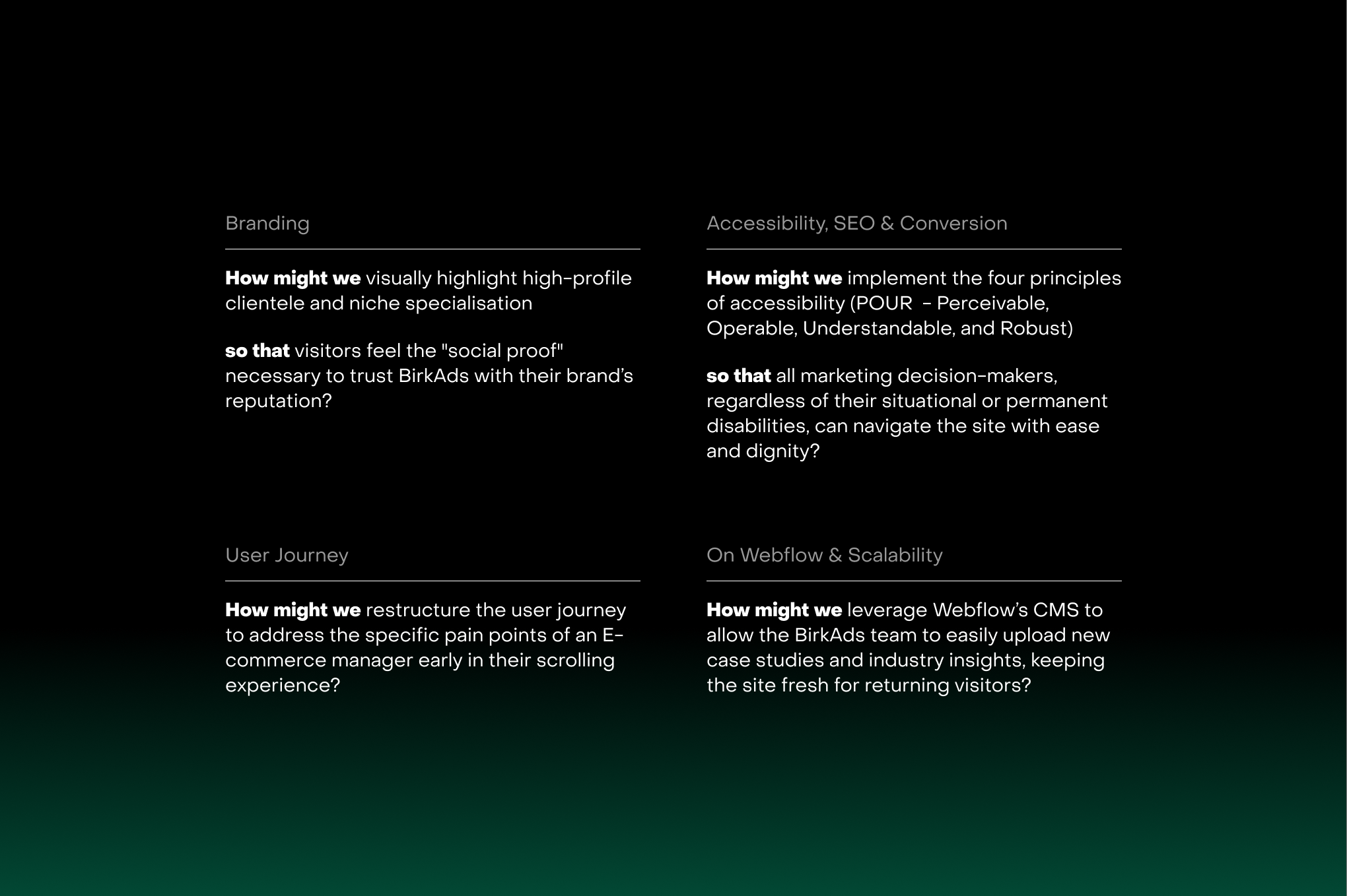
3. Our goals
4. Product development process: challenges and solutions
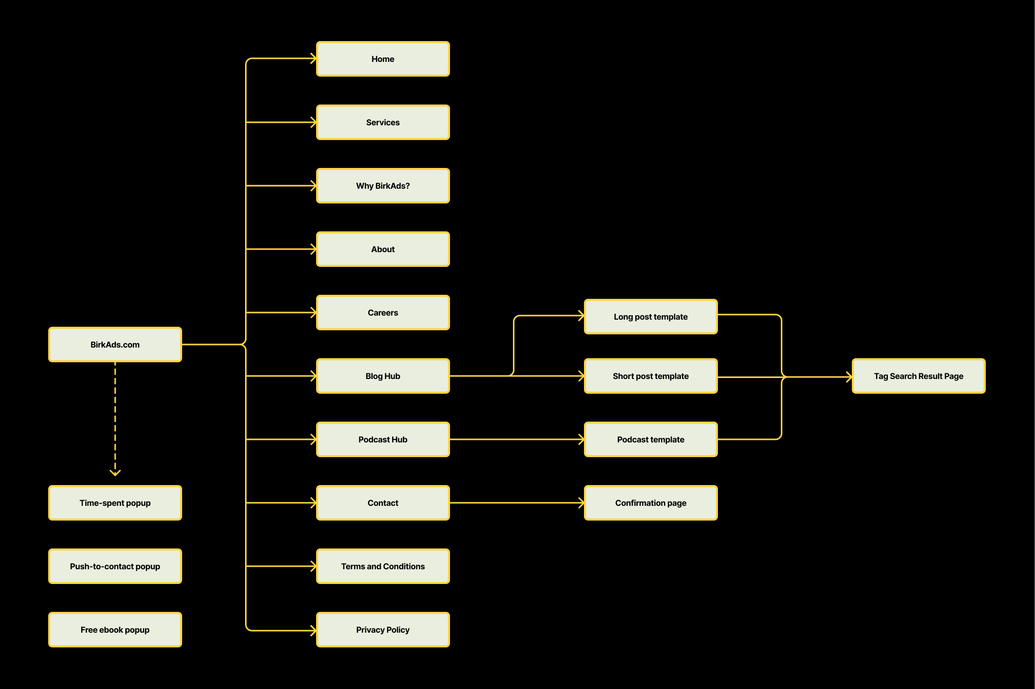
Defining the scope
Our team conducted extensive research into the client’s industry, needs, and pain points, ultimately defining a scope of work that encompassed 15 pages and 3 popups.
Wireframes - lesson learnt
My initial wireframes were overly detailed, resulting in extended timelines and numerous revisions. Simplifying the wireframes by removing extraneous brand elements would have expedited the process, particularly given the time spent on creating effective layouts based on Madis’s input.
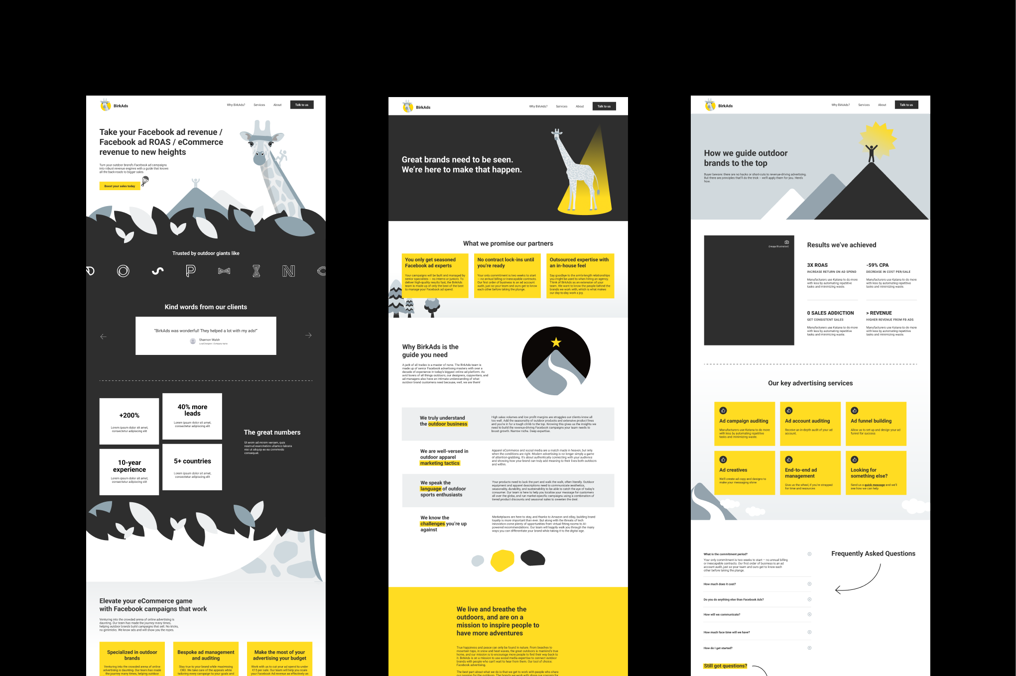
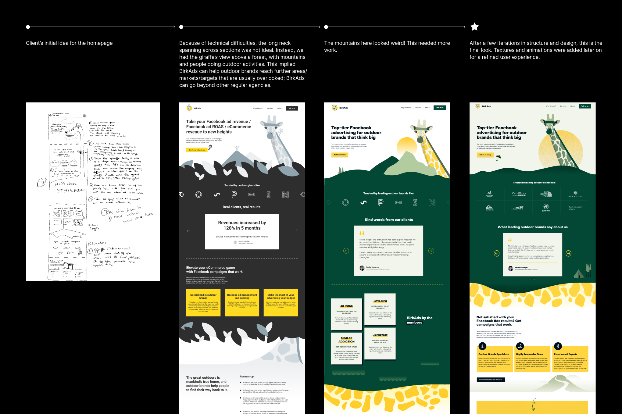
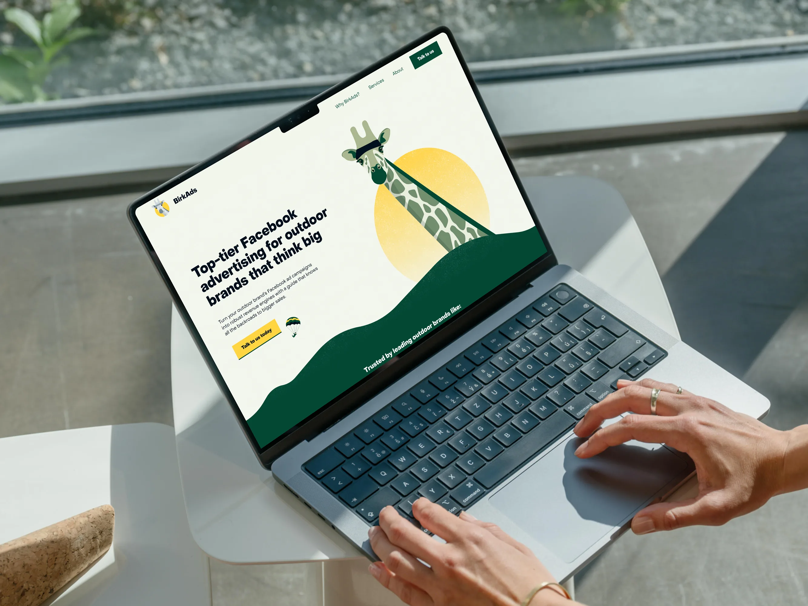
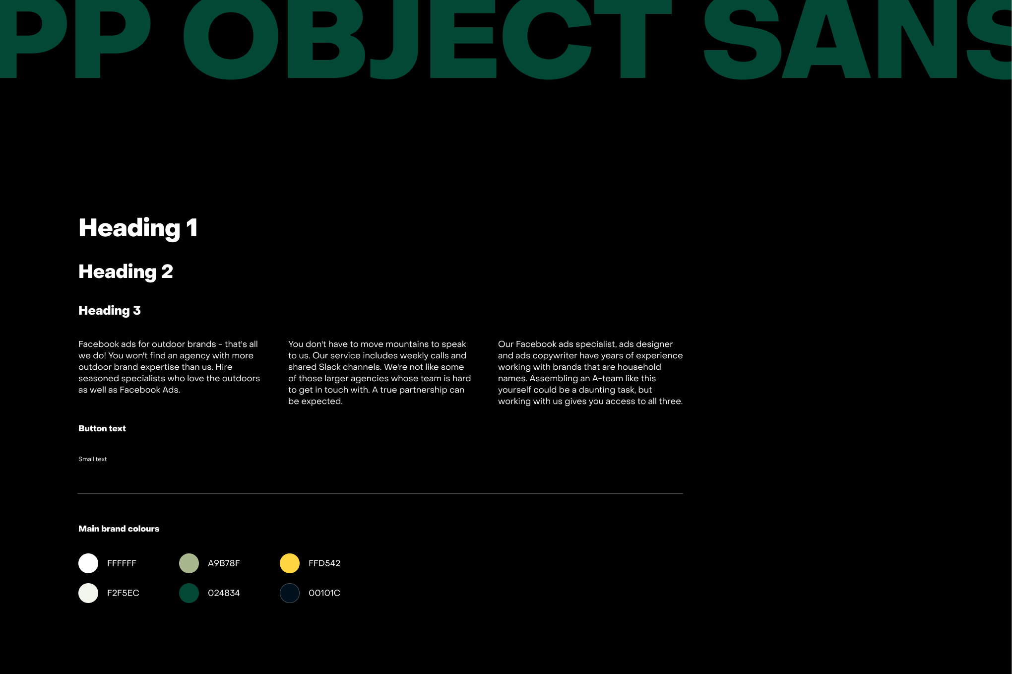
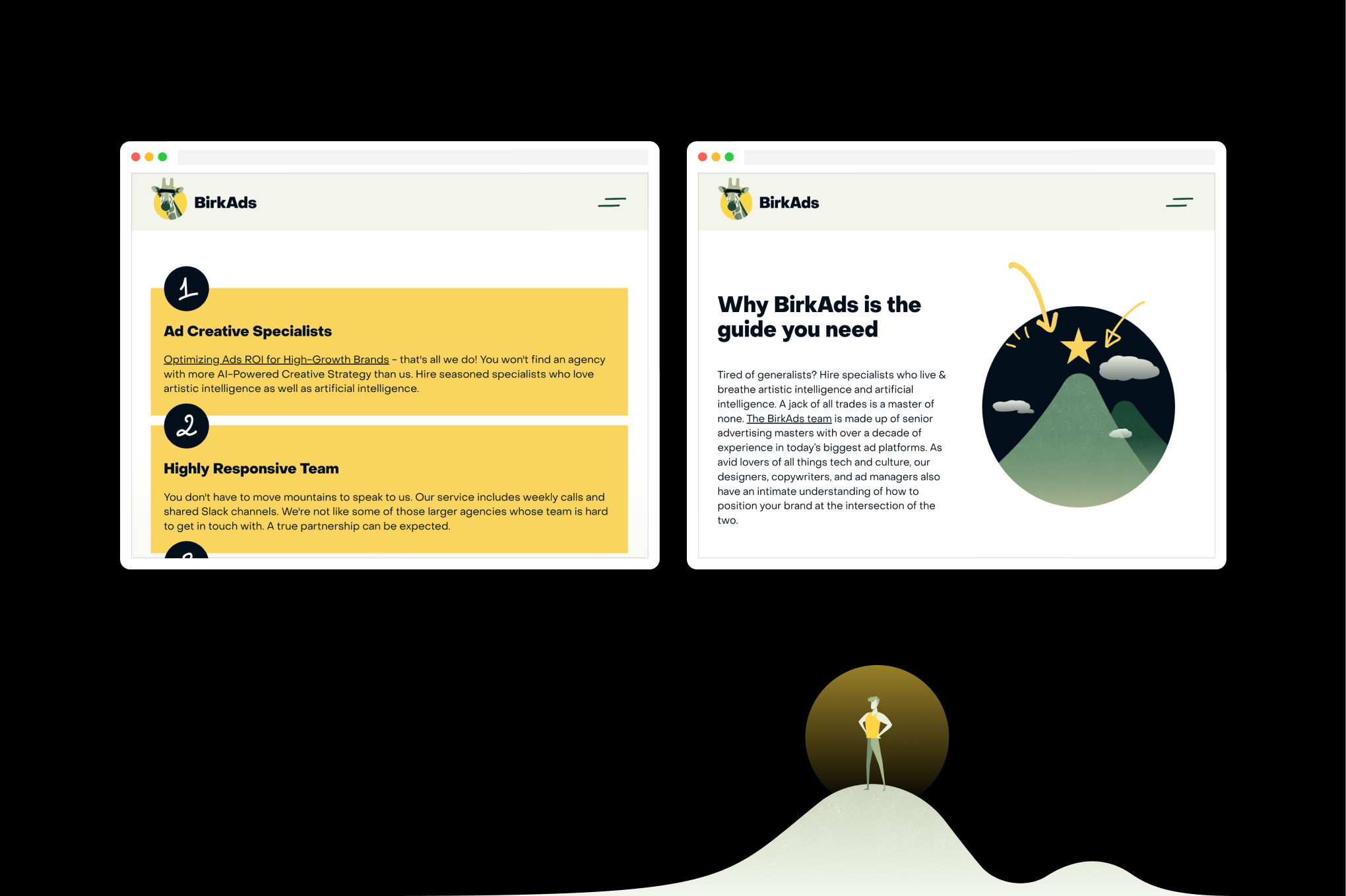
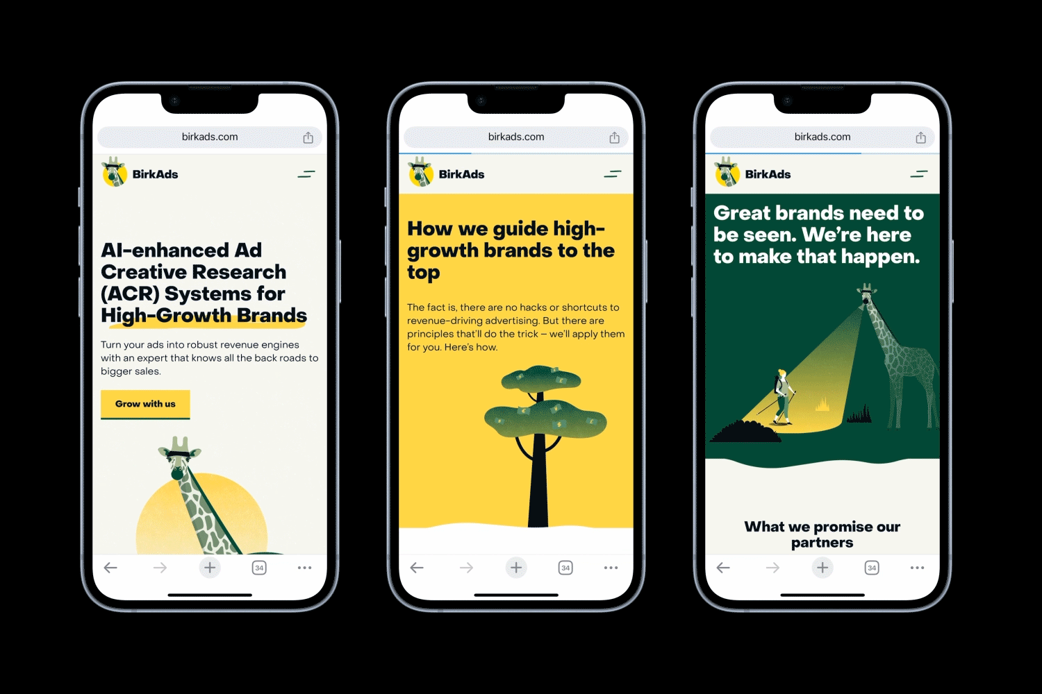
Revamped design system with strategic, scalable use of colours and typography
We expanded BirkAds’ original colour palette to create a versatile system allowing for various combinations. Through discussions with the client and his design team, we replaced dull greys with vibrant shades of yellow and green, representing nature and adventure. The new colours ensure good contrast between text and background, enhancing usability and accessibility.
We selected Object Sans from Pangram Pangram for its contemporary aesthetic and versatility. Adjustments to kerning and line spacing maximised readability, while lengthy passages were broken into smaller, more digestible sections, with noticeable size differences in headings to establish a clear hierarchy.
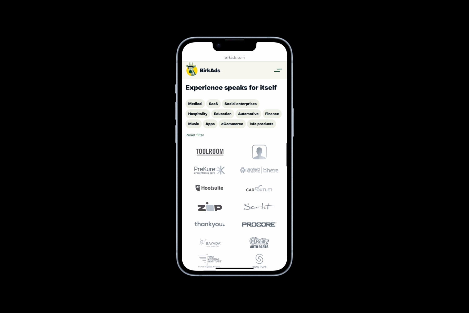
Client logos and testimonials - powerful tool to build trust and generate meaningful leads
With over 50 brands to showcase, we employed the Finsweet plugin to categorise them. A key challenge was to streamline the user experience for Madis, ensuring he could easily update logos despite lacking design or development skills. I created a Figma template for logo updates and recorded Loom videos to guide him through the Webflow CMS process, enhancing my presentation skills in the process.
Strategic CTAs and anchor links to guide viewers through key information and drive decisions
We proposed varied wording for buttons and strategically positioned anchor links to guide users without appearing overly repetitive. Integrating underlined words as anchor links in headings and body text proved an effective method for directing users through services, biographies, team members, and the contact form.
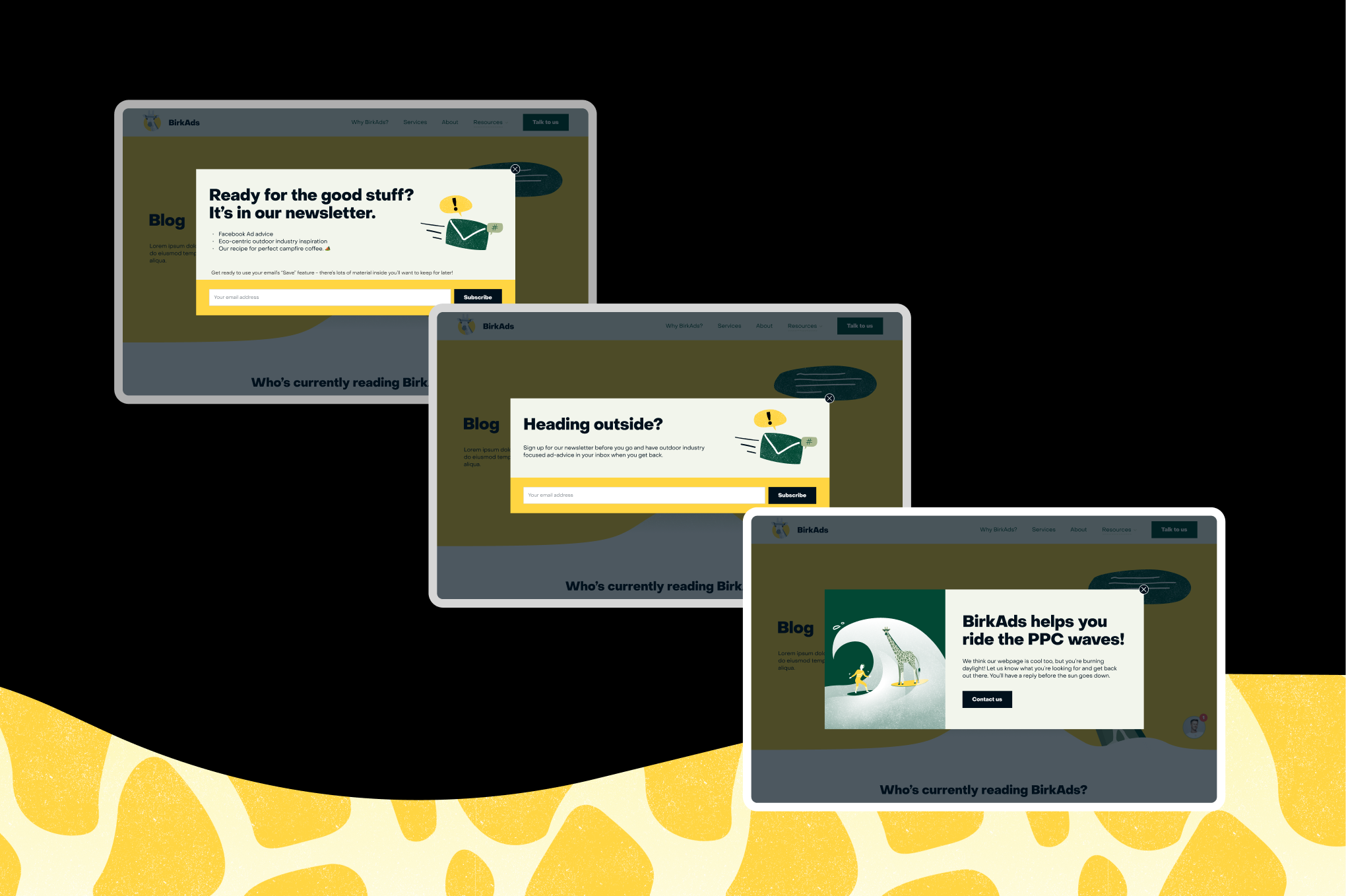
Popup system that collects user info and boosts engagement without disrupting the experience
The site features three popups: a time-spent popup, a push-to-contact popup, and a free ebook popup. Ensuring these popups were user-friendly across all devices was a significant challenge. I collaborated with Madis to refine the copy for brevity and adapted layouts for different screen sizes. Each popup was built with distinct practices in Webflow:
- Time-spent popup: Triggered when the cursor exits the page frame.
- Push-to-contact popup: Activated after the user spends time on a non-contact page.
- Free ebook popup: A small floating bubble in the bottom-right corner of the Blog hub, resembling a chatbot, to avoid disrupting the reading experience.
After observing that popups appeared too frequently, I consulted my Director to implement custom code, ensuring they displayed only once within a specific timeframe, utilising browser cache and cookies.
Scalable CMS resource system that organises and cross links podcasts, long form, and short content
BirkAds features enhanced Blog and Podcast pages, categorising content into long and short posts, with podcasts containing Spotify embeds and key quotes with timestamps. The resource pages have fixed side panels for easy navigation, including a table of contents, sharing options, and subscription CTAs.
After discussions on client needs and technical constraints, we determined that using tags for search functionality was optimal, given the volume of content produced. The Tag Search Results page allows viewers to skim blog posts and podcasts grouped by specific tags. Developing the logic to nest and connect various CMS collections posed a challenge, but we successfully implemented it.
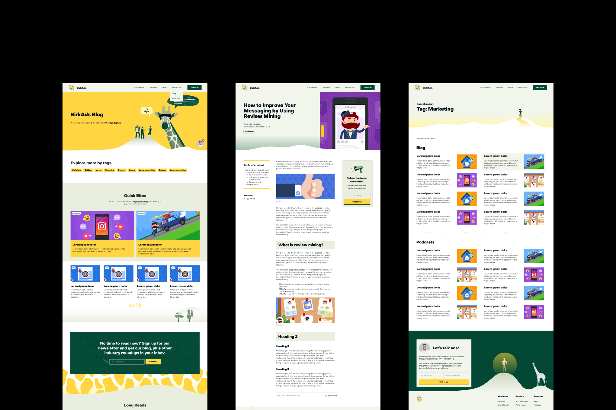
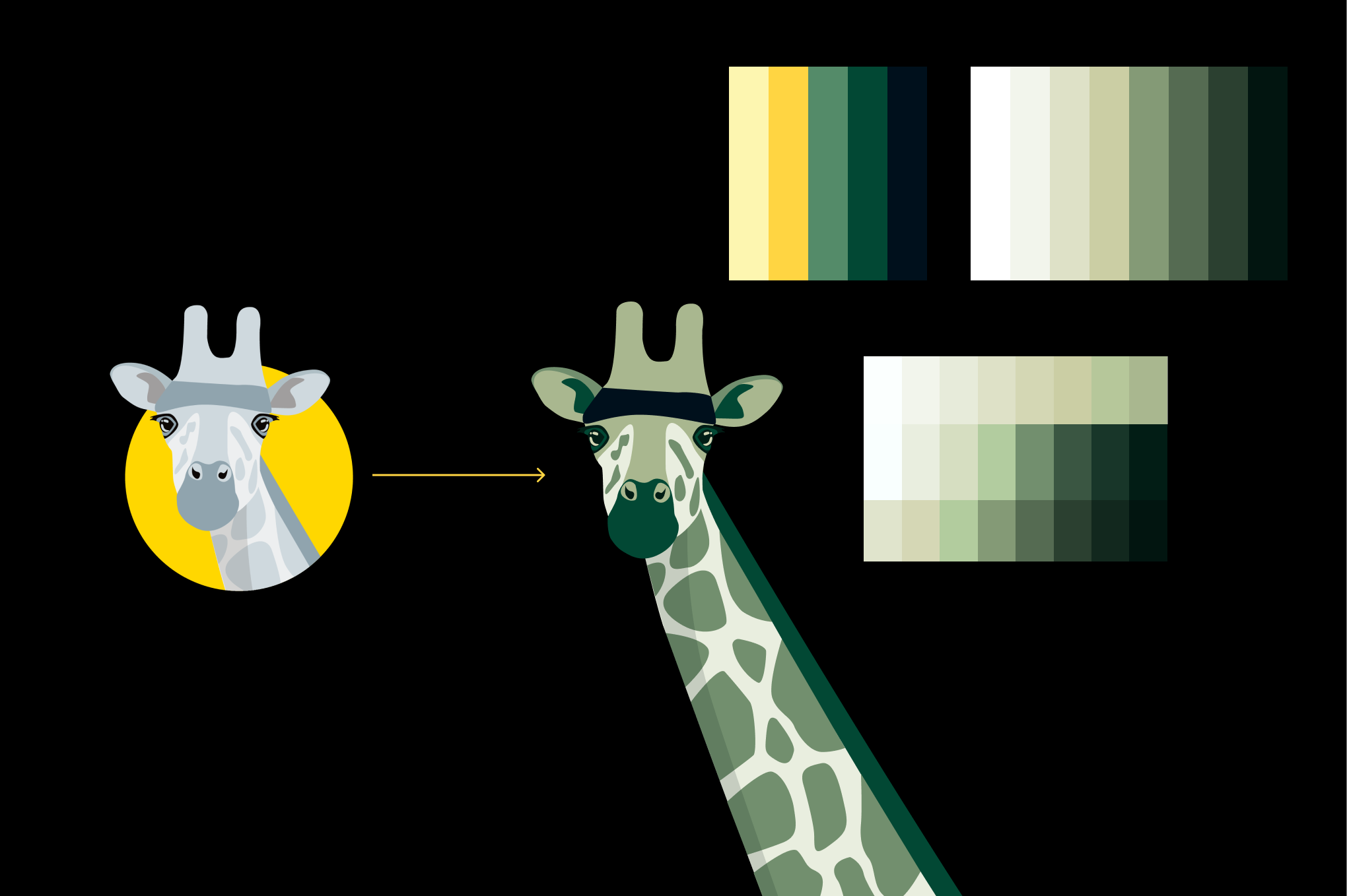
Engaging visuals and interactions, fast and responsive
I designed a combination of vector illustrations, grainy textures, and scribbles using Photoshop, Illustrator, and Procreate. Subtle animations of elements such as the giraffe and human figures conveyed the brand's playful and dynamic nature. Each hero illustration serves as a page summary, with on-click and on-hover interactions for added engagement.
Challenges included ensuring responsiveness and seamless integration of illustrations, reducing loading times to enhance Google rankings, and using interactions strategically to guide users. We devised solutions from the high-fidelity mockup phase onwards, ensuring background illustrations blended seamlessly with section edges. All illustrations were resized for smaller screens and uploaded in SVG format where feasible. Micro-interactions were applied strategically to highlight key areas, such as hero sections and CTA buttons.
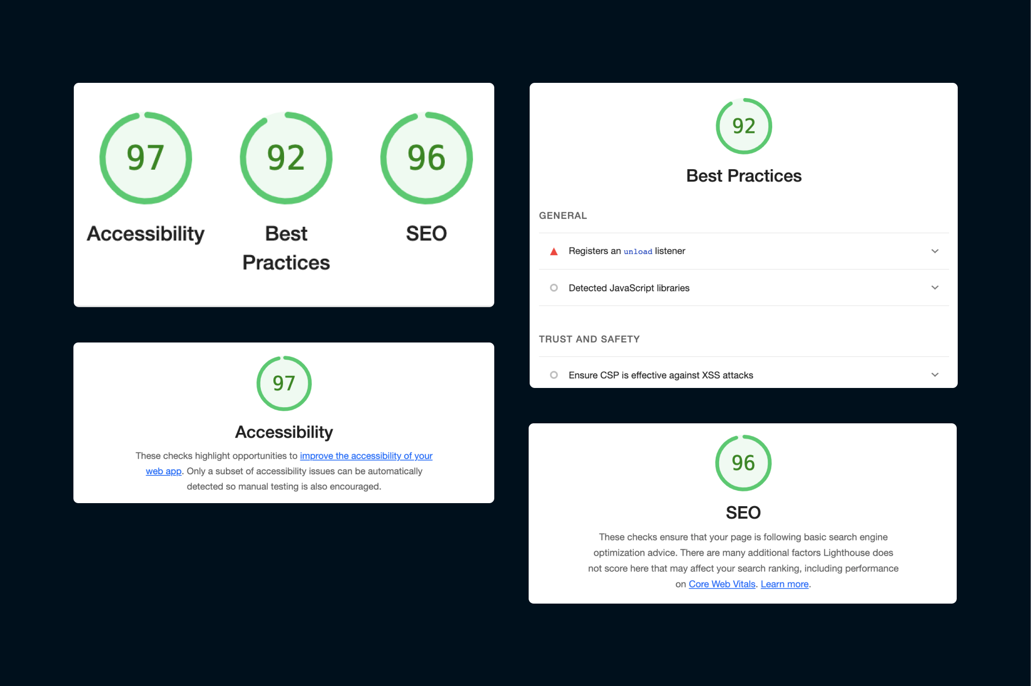
Optimised for performance
Through a close collaboration with Madis, whose SEO expertise was instrumental, we achieved strong Google Lighthouse scores. The site now performs exceptionally well across Accessibility, Best Practices, and SEO.
5. Conclusion
The BirkAds project was intensive, requiring extensive communication, meticulous planning, and a deep understanding of Webflow. I gained invaluable insights and expertise from Madis, an advertising and marketing specialist. I was delighted to see the site go live and gain visibility on the client’s social media.
Sources
Check my other projects
Let’s connect!
I’m a UX/UI designer with 4+ years of graphic and web design experience. I enjoy analysing digital products to see what works (and what doesn’t) and aim to balance user needs with business goals while keeping experiences fun to use. I’m curious, always learning, and currently exploring AI tools and front-end coding to speed up workflows.
If you’re looking for a designer who asks smart questions to solve problems, let’s connect!


